Design Systems Built for AI Collaboration (Part 1):From Style Guides to Structured Components
Nov 10, 2025 · 5 min read
An experiment in using automation and AI tools to smooth out the build process: generating a Figma design system and component library with less effort, and structuring it finely enough that AI can read and reuse the design information afterwards.
TL;DR
- Experiment goal: Test whether a modular structure and Figma Variables can make AI-generated output easier to organize and reuse.
- Approach: Use Relume to set up the style and tokens first, generate screens with Figma Make, then converge everything into a component library.
- Key finding: AI is efficient at generating screens, but the overall flow is still mostly one-directional, and later adjustments still need to go back to code or be fixed by hand.
1. Once design starts collaborating with AI, structure matters
In the past, a lot of a design system was made for people to read.
Style guides, naming rules, component splits: usually it was enough if the team itself could follow them.
But once I started using AI tools, things felt different.
The design structure directly affects output quality.
How variables are grouped, how components are split, how things are named: all of it affects whether the AI can use these things correctly in the end.
So this time I mostly cared about one thing:
If the structure is organized clearly from the start, does the AI generation that follows become more stable.
2. Converge the workflow to the simplest version first
This time I did not do a tool comparison, I just pushed the flow to the minimum.
Since the design already happens in Figma, the whole flow basically stayed inside the Figma ecosystem.
The flow I settled on was:
Relume → Figma Make → Figma component cleanup
I left other tools out for now to avoid making the flow too complicated.
The point this time was just to confirm one thing:
In the most minimal setup, can this flow actually run all the way through.
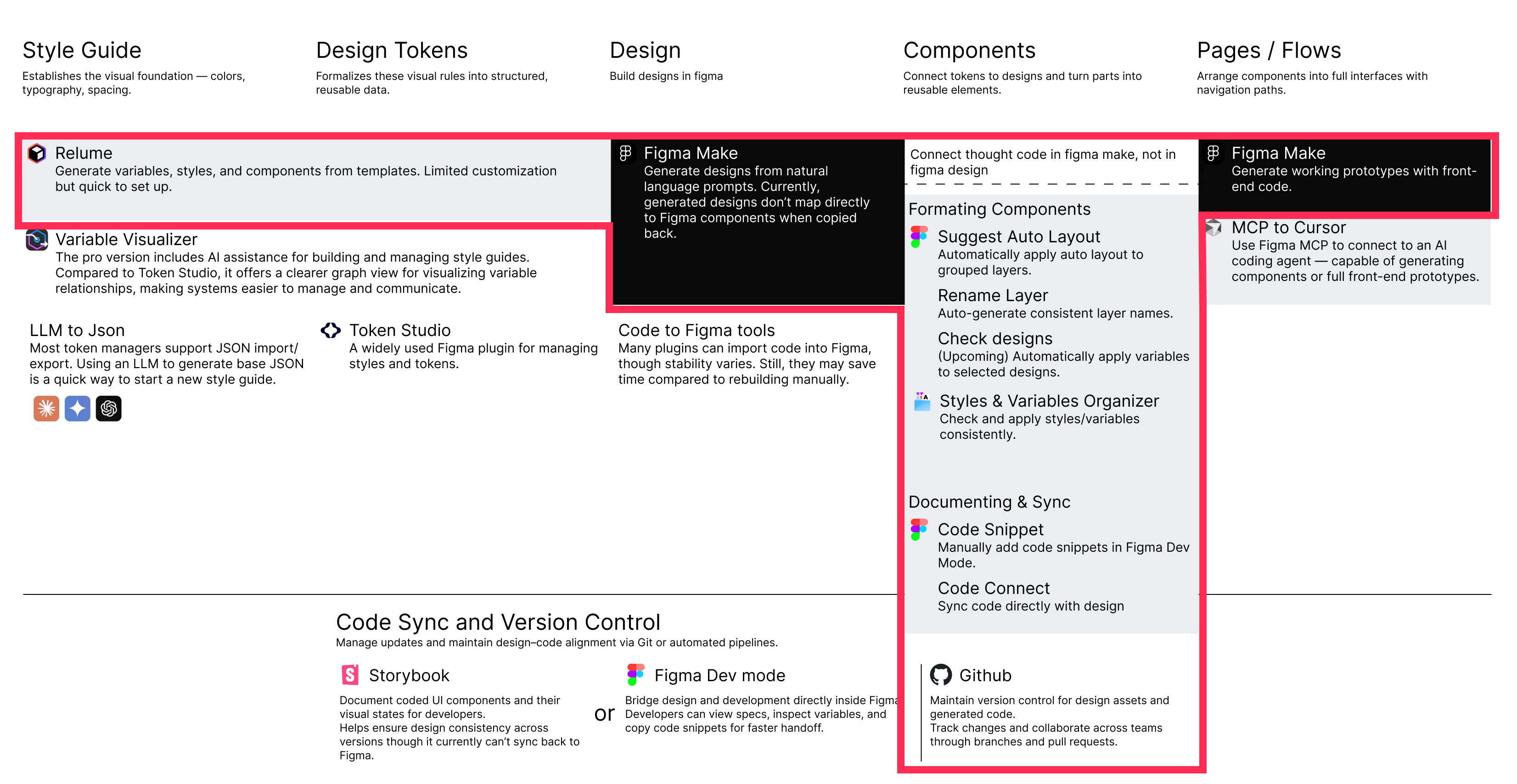
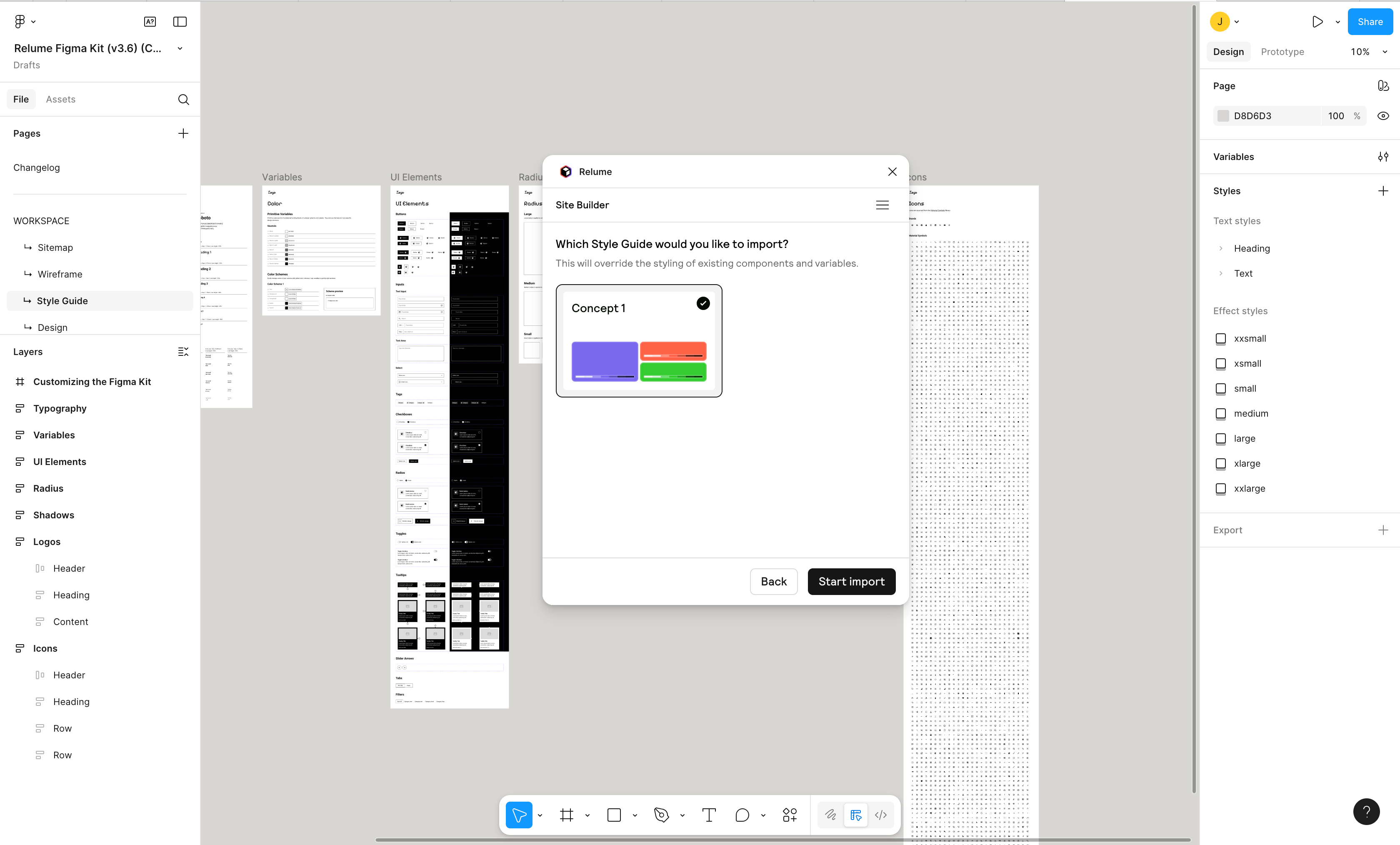
3. Relume: laying down the structure first
The flow starts with Relume.
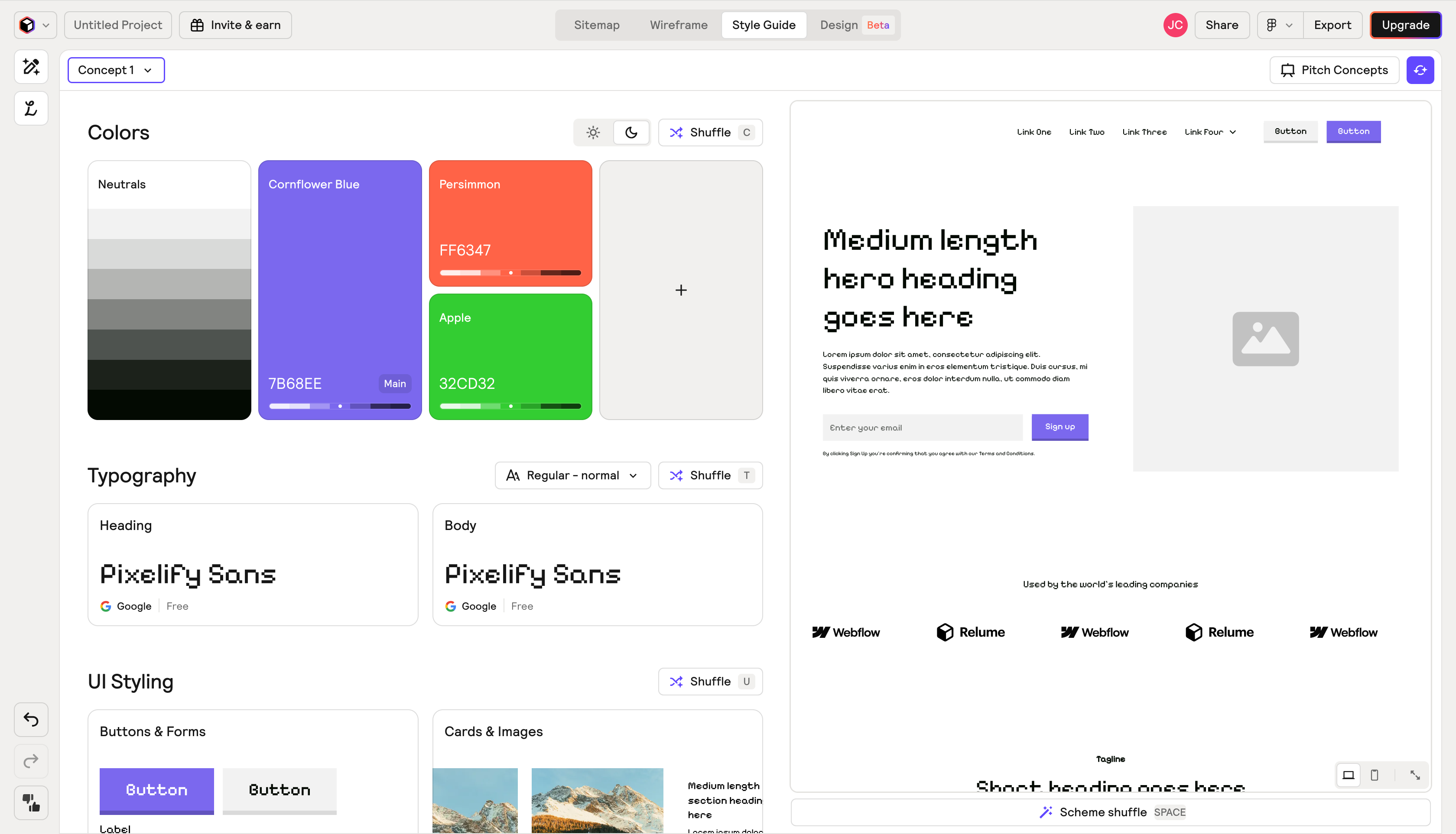
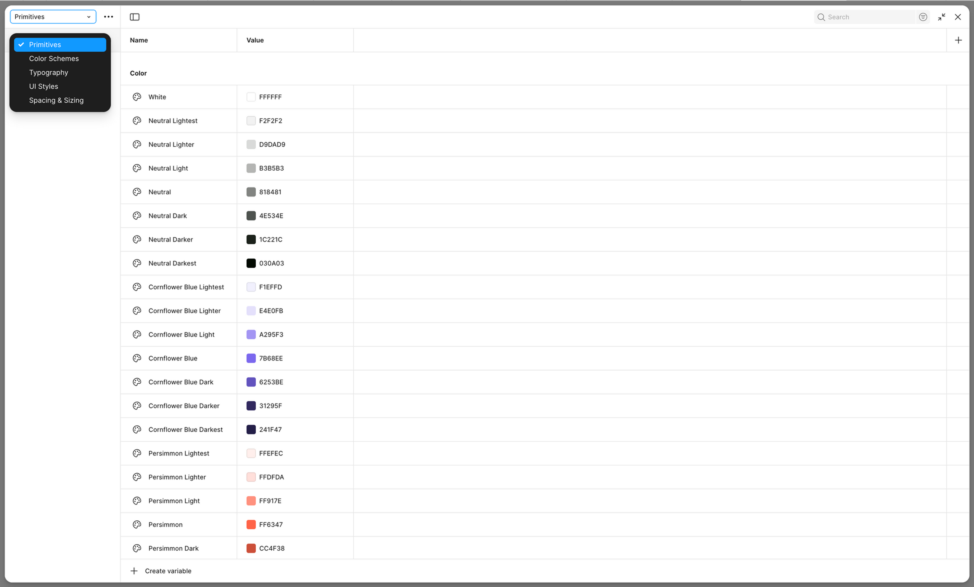
It is mainly used to quickly produce a base style guide, covering the most basic design tokens like color, type, and spacing.
There is not much to customize, but as a starting point it is enough.
What I cared about in this part:
Whether the AI can directly understand and use this kind of structured design token later.
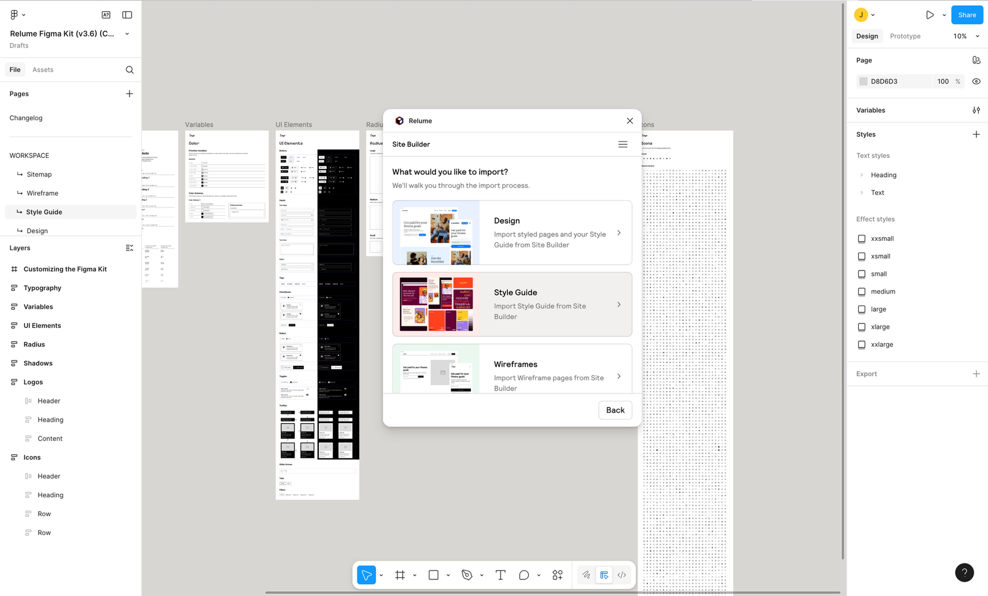
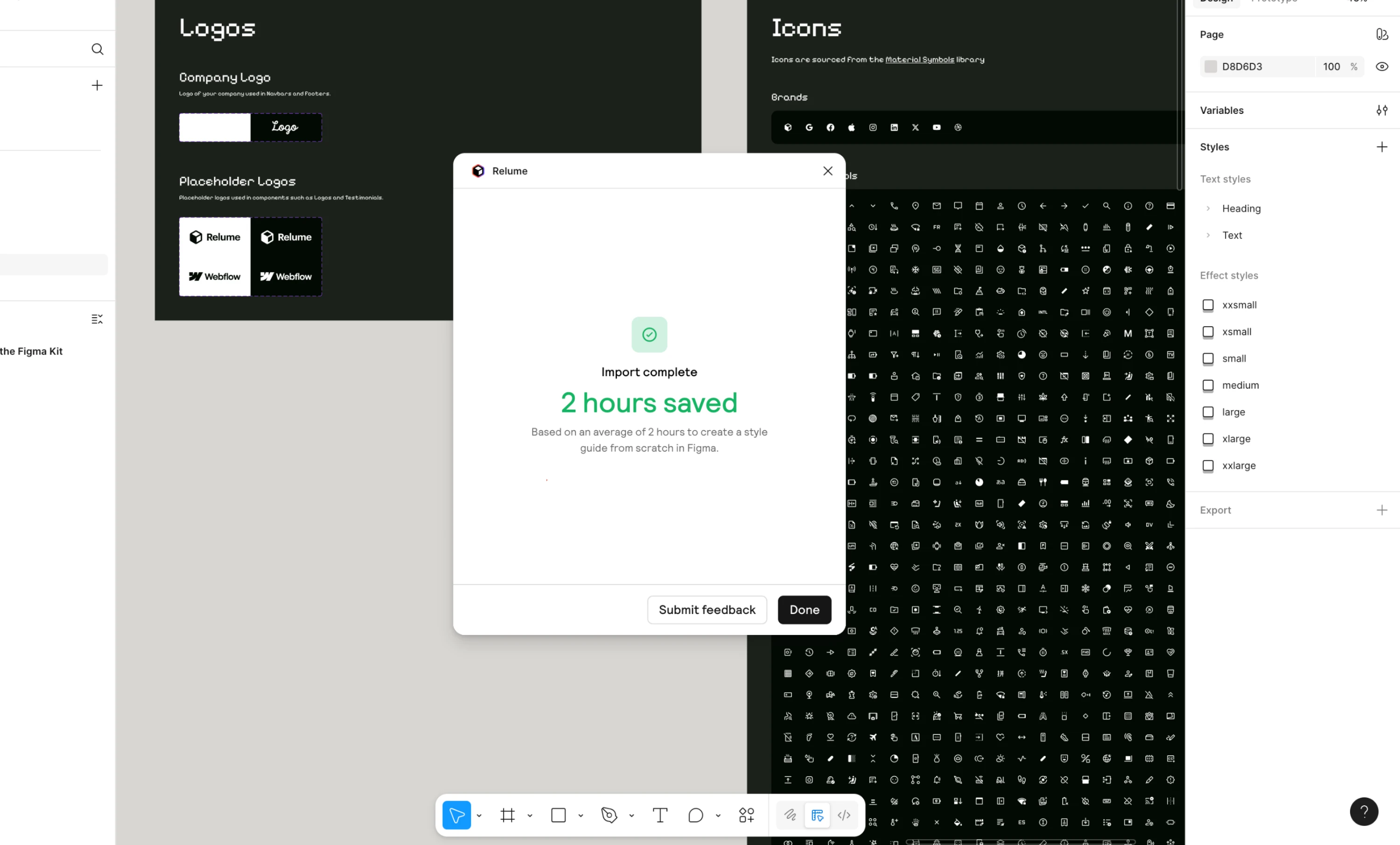
So after importing into Figma, I went back and reorganized the naming once more to keep the variable groups more consistent.
This step took a bit of time, but it helped the overall stability later.
4. Generate screens with Figma Make, then come back and converge them into components
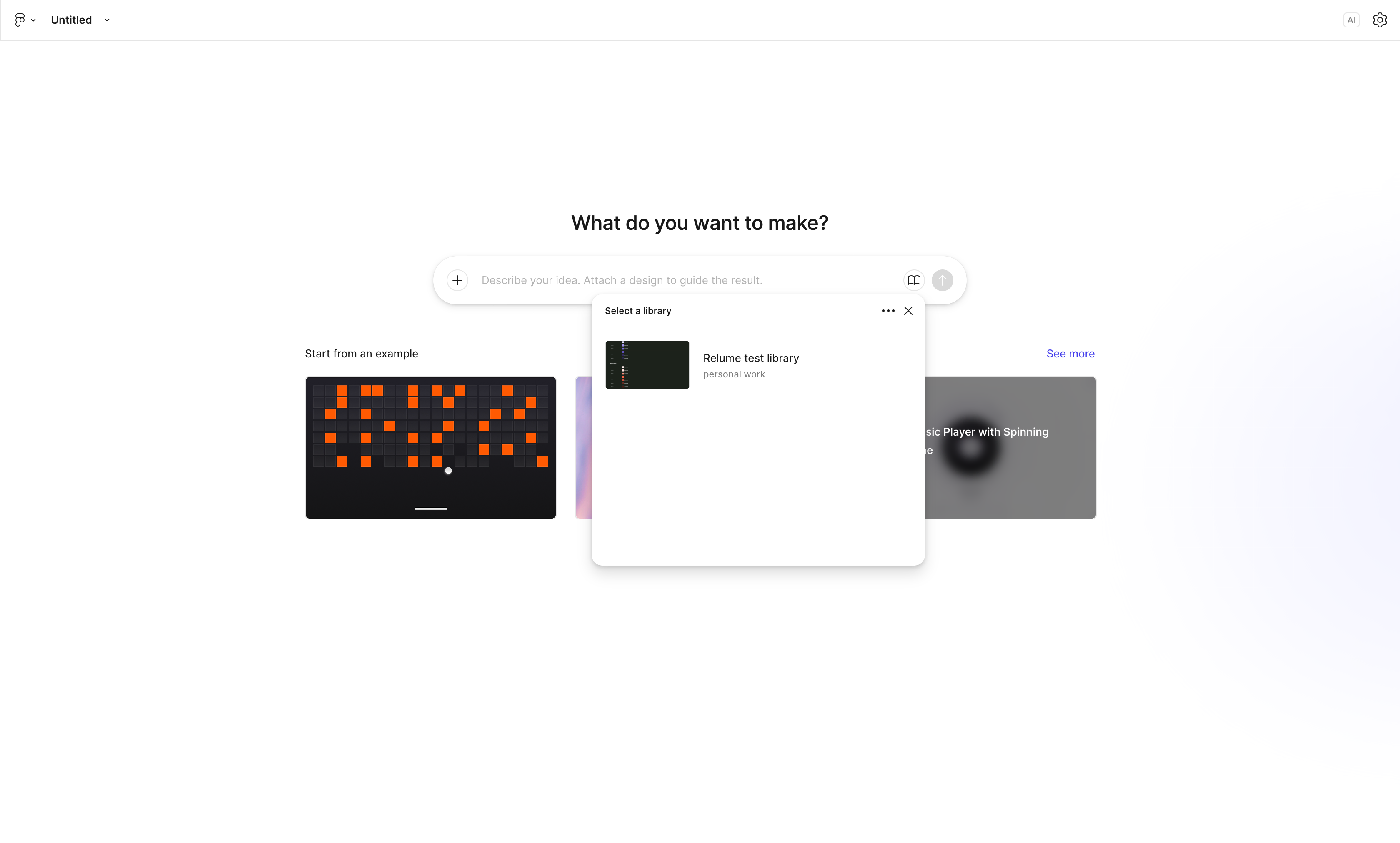
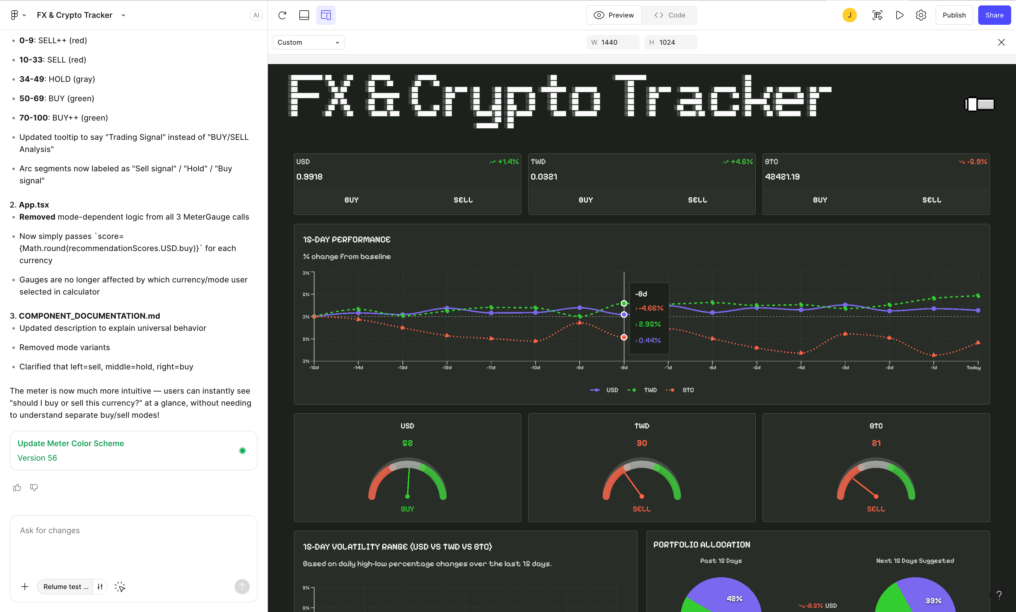
With the variables in place, I started generating the interface with Figma Make.
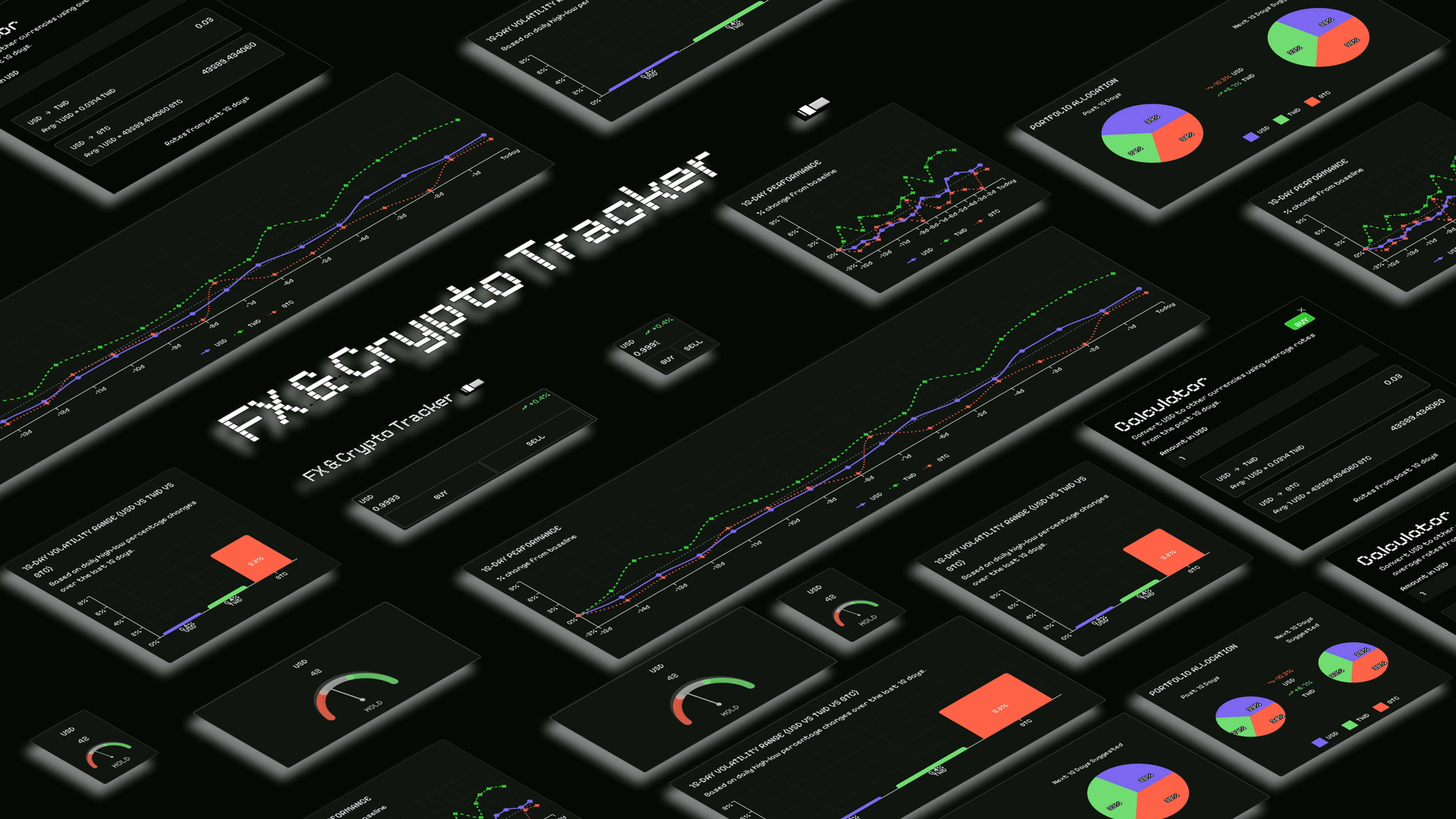
The goal this time was a small dashboard with charts, cards, and basic dashboard components.
At first I tuned it with prompts, going back and forth roughly 40 to 50 times before it settled.
A few situations came up along the way:
- Some details like gradients, shadows, and SVGs drift during conversion
- The structure gets a bit loose and needs Auto Layout pulled back into place afterward
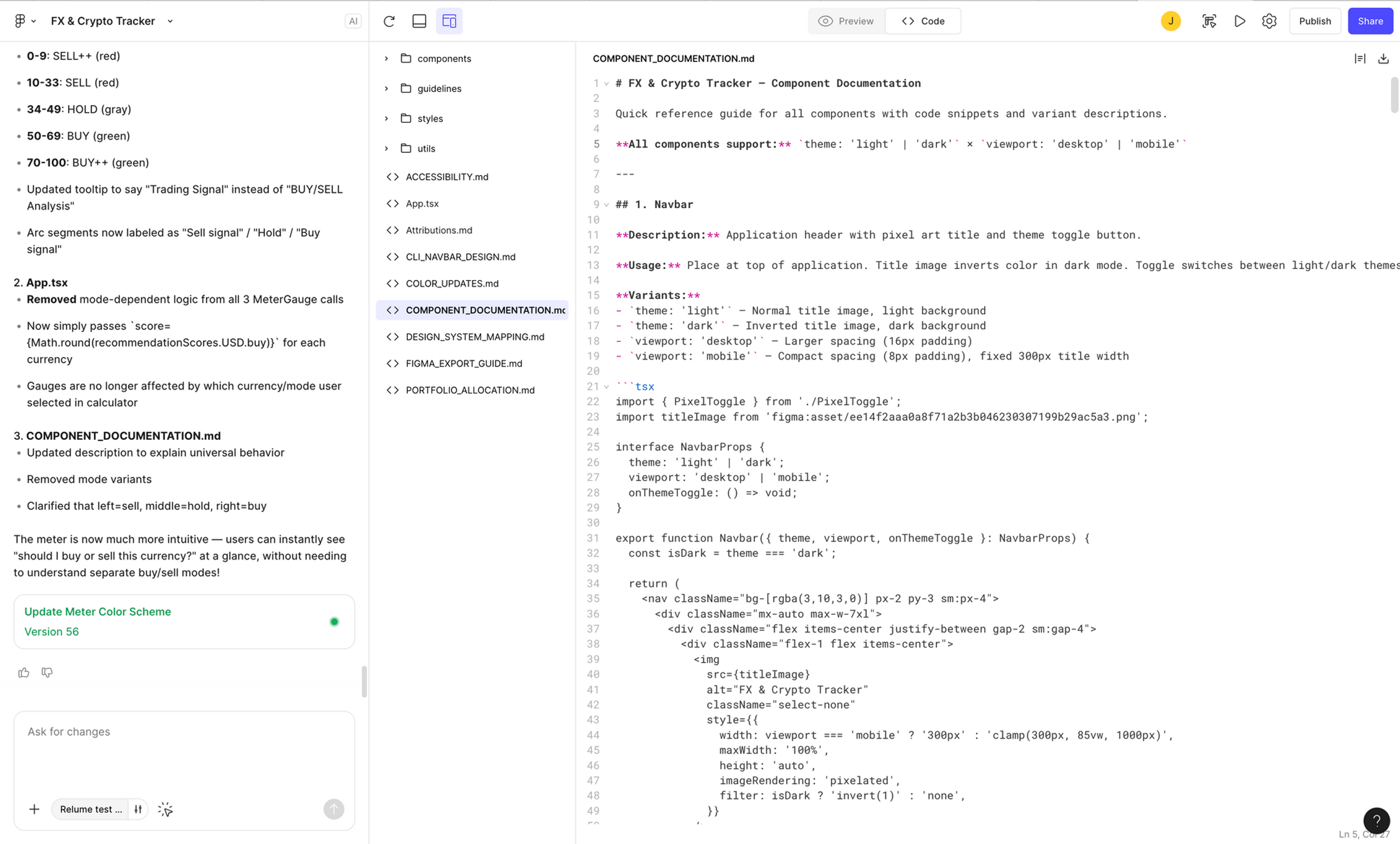
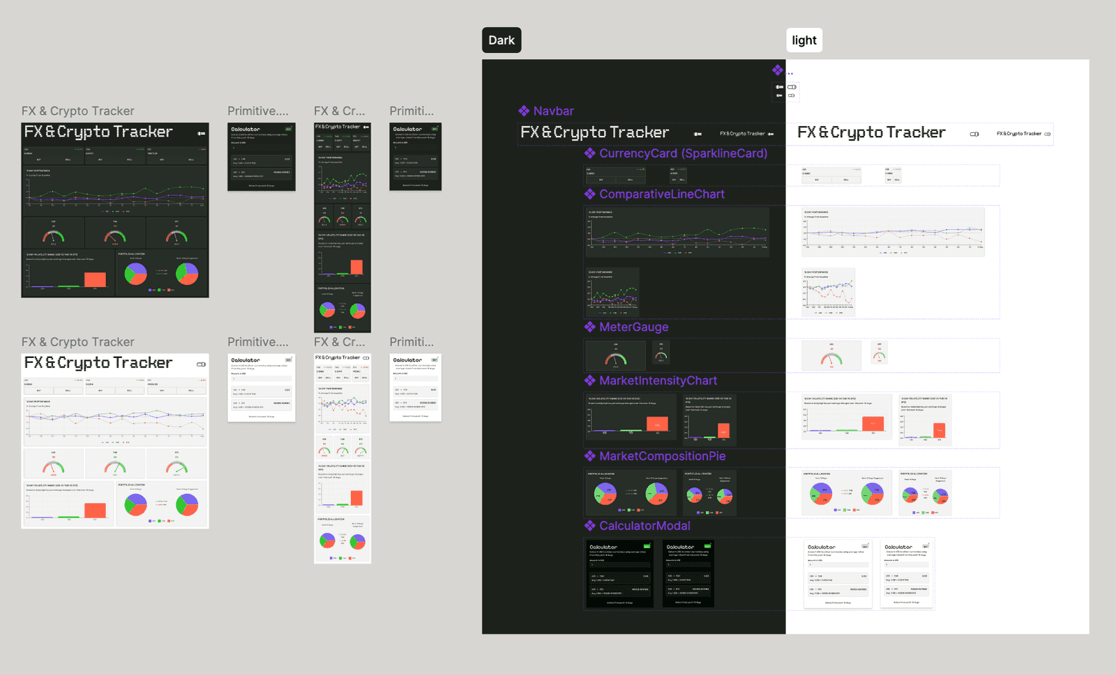
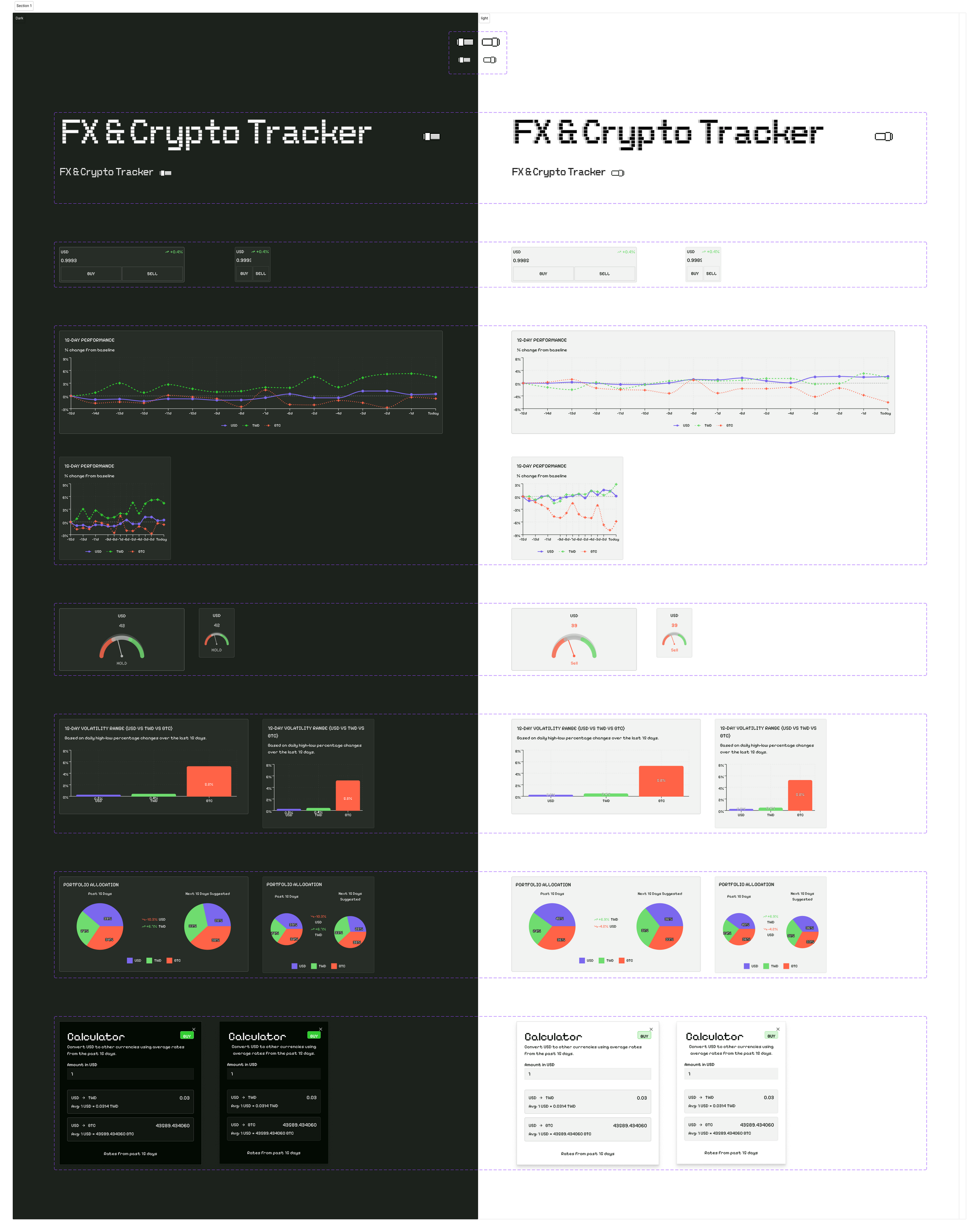
So in the end I still went back into Figma to organize the component library once.
I pulled out the more stable parts and made them into:
- Navbar / Currency Card / Line Chart / Gauge / basic layout components
Only after this step did the whole system feel reasonably stable.
5. One thing that stood out
After this round, one thing felt very direct:
You do not necessarily have to rebuild a full design system inside Figma.
What Figma Make produces can already serve as a baseline on its own.
The more reasonable approach becomes:
Keep a small set of core components, let the AI generate the rest, then converge.
The designer's role is more about the final structural cleanup than building everything from scratch.
6. Project reflection
Overall, this flow works, and it really is much faster than the traditional way.
But there are still a few limits right now:
- AI is well suited to generating structure, but not good at handling detail consistency
- The conversion from Figma Make to Figma is still one-directional
- The ability to write design back into the tools is still incomplete
So in actual work, there is still back-and-forth adjustment.
Tools like Cursor are actually more direct in the later stages, because you can change the code directly and see results quickly.
7. Conclusion
This experiment was more about confirming one thing:
Once AI starts taking part in design, the focus of the flow gradually shifts from "what to draw" to "how to make the structure understandable."
- Relume handles the foundation
- Figma Make handles generation
- Figma handles converging it into maintainable components
Overall it goes smoothly, but it has not yet become a fully two-way flow.
The next part continues into Cursor and the integration with the actual development stage. See the next part.