Culture Hop Taiwan:Building Infrastructure for Cultural Discovery
Dec 27, 2025 · 4 min read
I reorganized fragmented government open data into a bilingual, map-first platform for exploring cultural events. The work centered on three problems: scattered data sources, inconsistent languages, and a heavy mobile experience.
Taiwan has a dense cultural scene, but the information is spread across separate platforms. For foreign users there is no clear entry point, and even locals spend real time switching between sites and comparing listings.
This project set out to handle one thing: how to take all that scattered data and reorganize it into a single place you can explore directly.
On the design side, I used two dimensions to understand user behavior: how well someone can read the language, and whether their plans are spontaneous or planned ahead. That left me with four main usage situations.
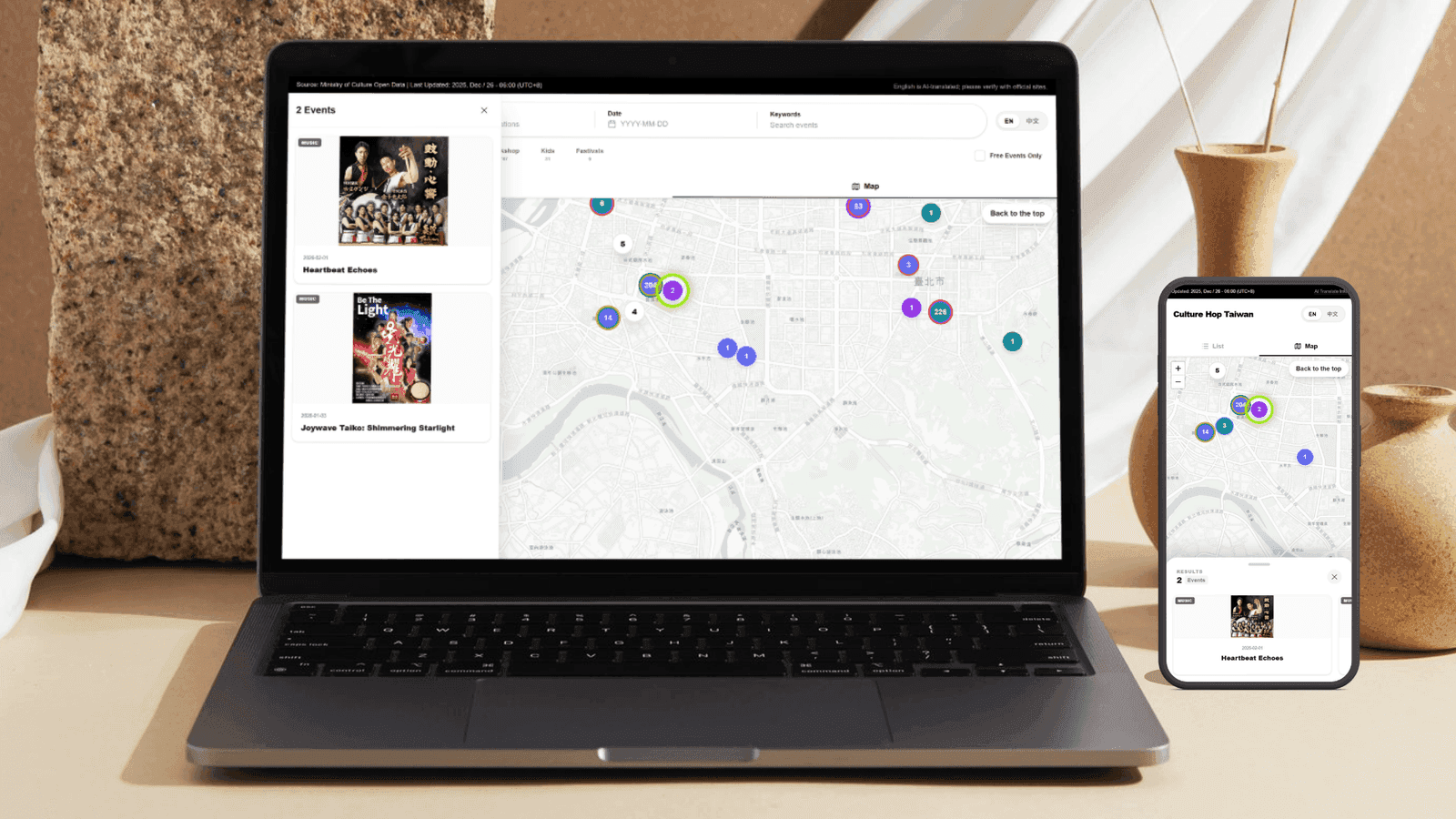
The system itself sits on a discovery layer that turns government open data into bilingual content, with the map as the primary way to carry that information.
It now runs as a self-updating version that serves travelers and local users at the same time.
Information inequality driven by language
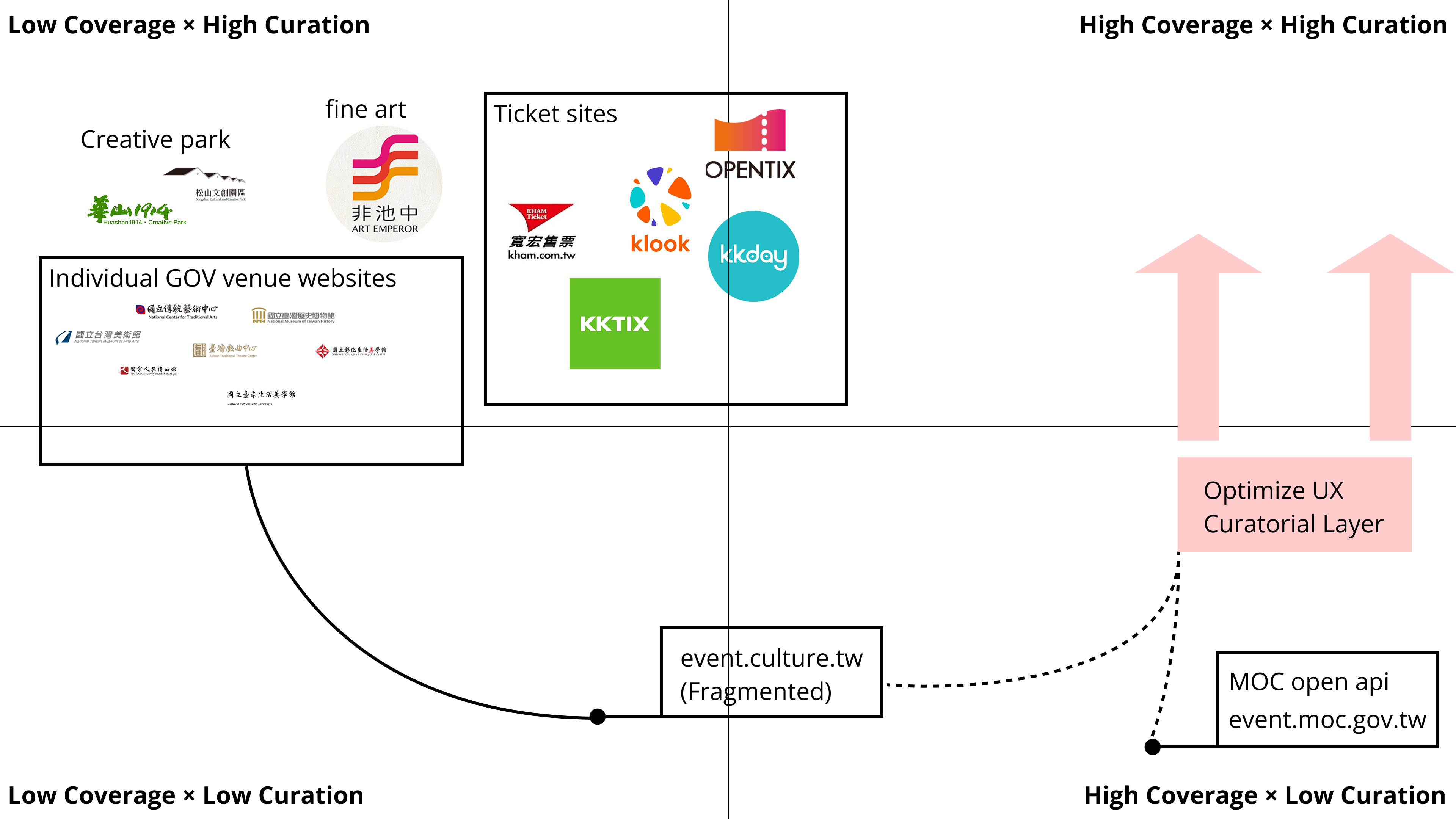
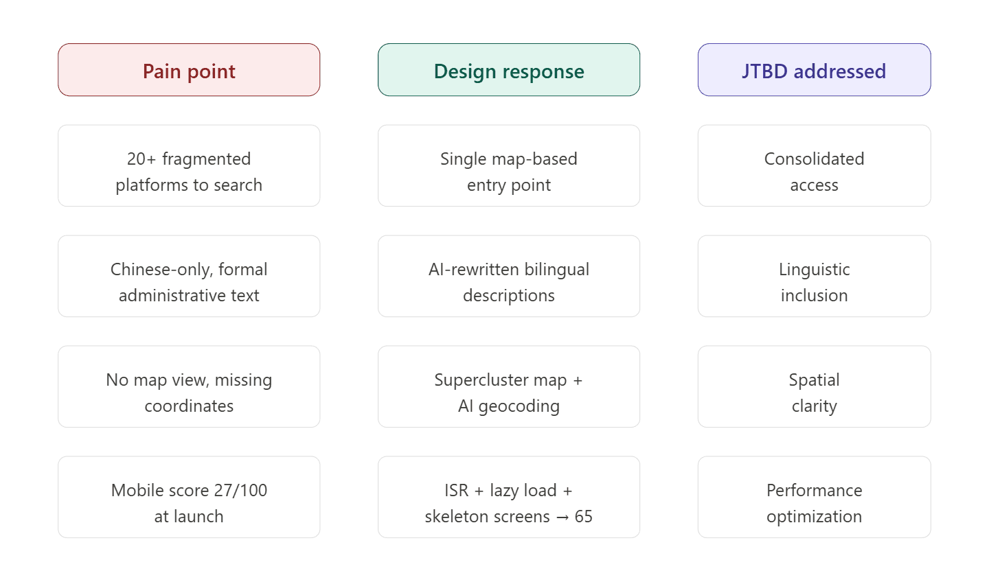
Taiwan has a rich cultural calendar, but the information is fragmented. One exhibition might show up on a cultural-bureau site, a maker market on Instagram, and a music event on a ticketing platform. The government offers open data APIs, but most of it stays in raw format and is never reshaped into something an ordinary person can read.
Over time, this adds up to a few things:
- Foreign users struggle to even get into the cultural-event system
- Locals have to compare back and forth across multiple platforms
- Many events are never effectively seen at all
What Culture Hop Taiwan set out to do is pull this information together. The goal was not to add yet another source, but to gather the existing sources into one entry point, so users can start exploring without first having to understand the system itself.
How I framed the user groups
This project did not lean on personas. Instead I used user groups to frame the needs, to avoid over-interpreting them.
I worked from two dimensions: whether the language lets someone read the content smoothly, and whether they search on a whim or arrange things ahead of time.
Crossing those two dimensions produces four distinct usage situations that describe real differences in behavior.
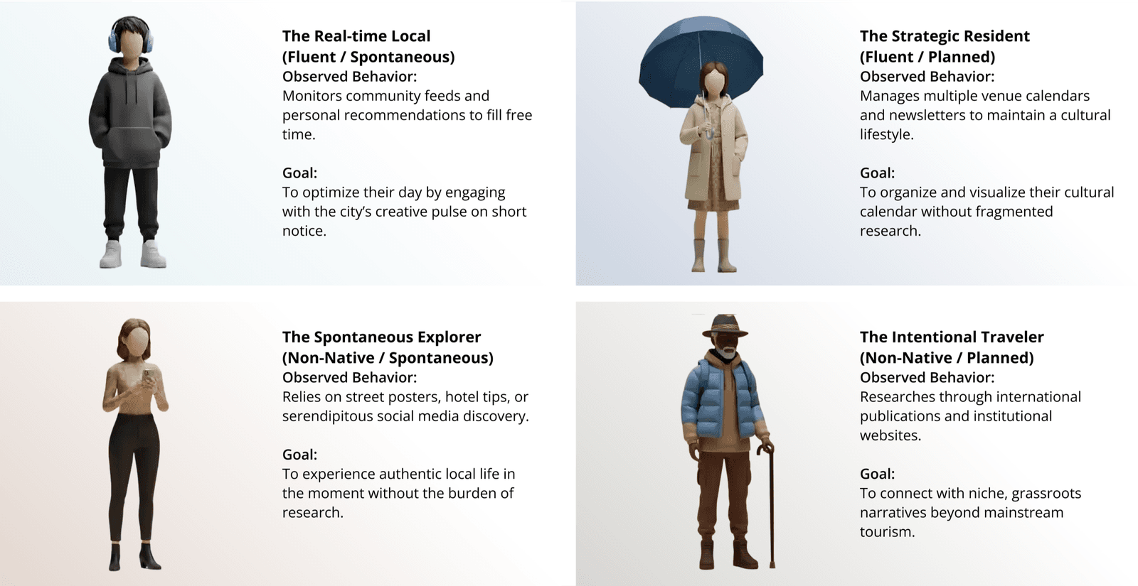
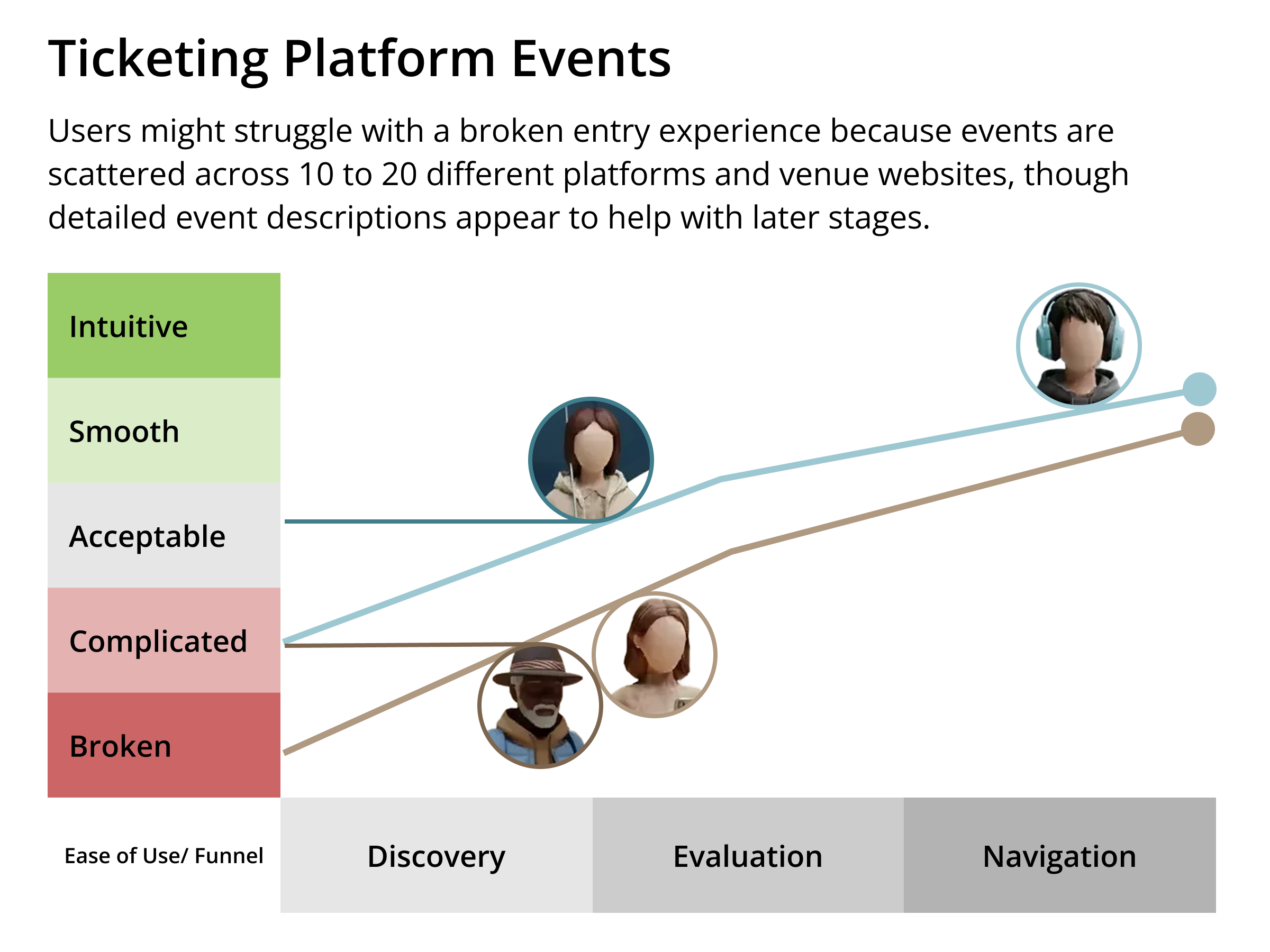
Four user scenarios
- Spontaneous non-Chinese users: They see an event on the street or in a social recommendation and just decide to go. The decision is very short, and what matters is immediacy and accessibility.
- Planning non-Chinese travelers: They usually do some research before the trip, hoping to find events closer to local culture. They care not only about the event itself, but also its background and cultural context.
- Spontaneous local users: Mostly through Instagram or friends, they decide where to go in a pocket of free time. Their behavior leans toward quick browsing and fast decisions.
- Planning local users: They follow arts exhibitions and cultural events over the long term and organize their own itineraries. What they care about is whether the information is centralized, not whether it exists.
These four users come from very different backgrounds, but the problems they hit in practice are close: the information is too scattered, and there is no entry point they can walk straight into.
Breaks in the journey
Once I broke the whole flow apart, a few recurring problems became obvious.
- Grassroots events lack English or bilingual information
- There is no data connection between platforms
- Users have to piece together time, place, and content themselves
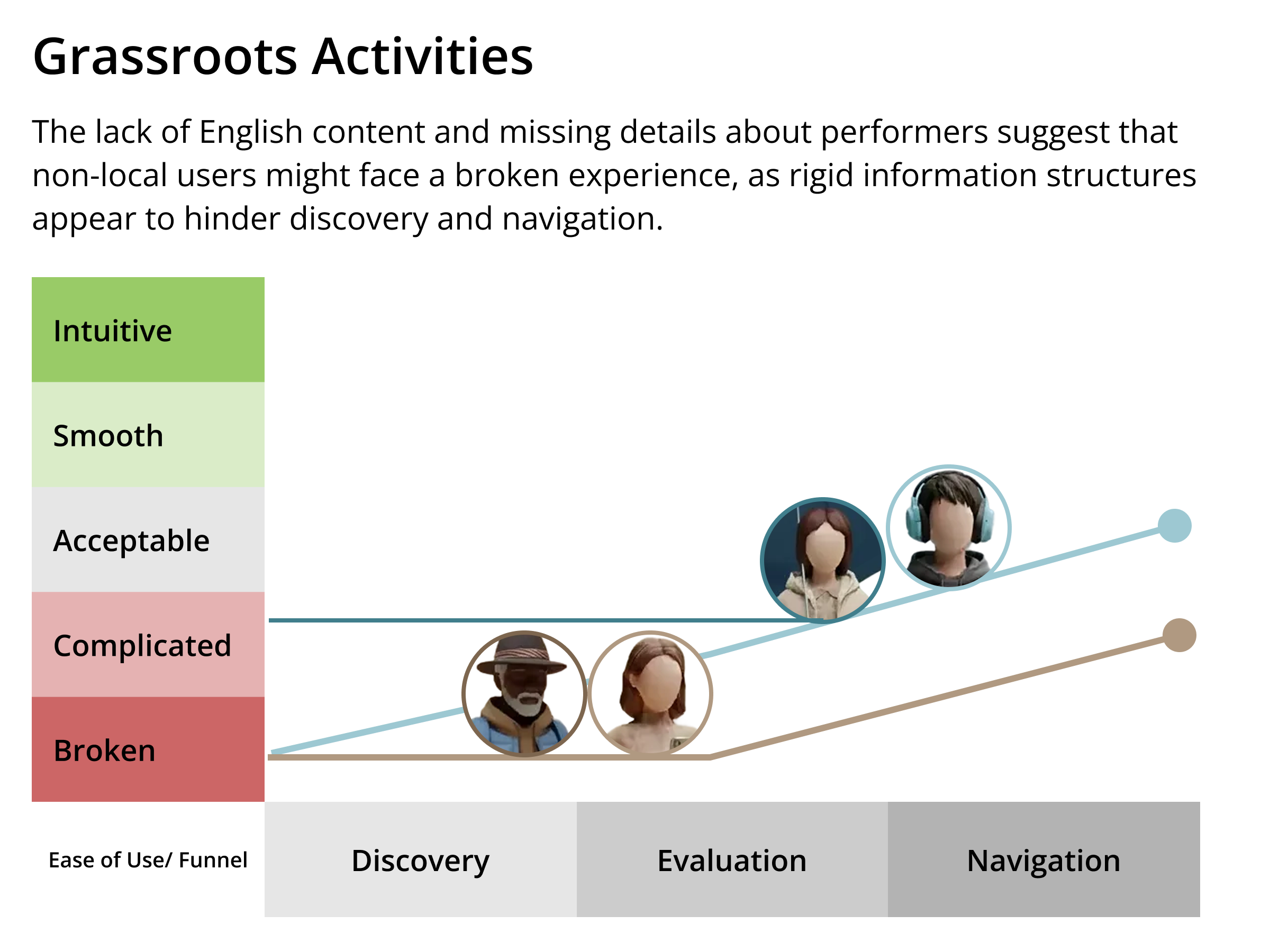
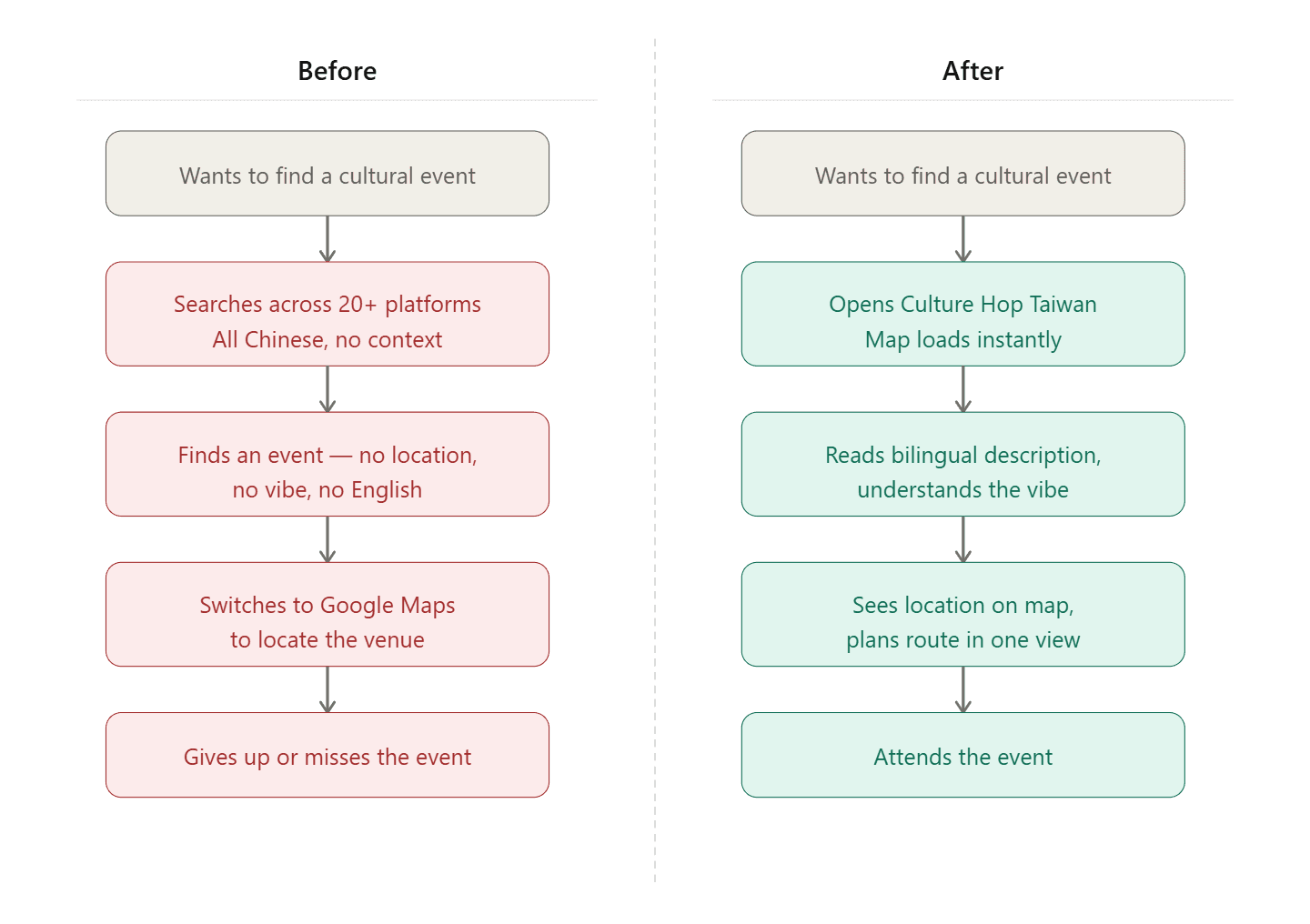
In practice, the flow often ends up looking like this:
search → open several sites → compare → give up or postpone
Three core design directions
After working through these problems, the design converged on three directions.
- A single entry point: Users no longer have to figure out which platform to look on, and instead start exploring from one place.
- Bilingual content that can actually be understood: Beyond translation, what matters more is adding the background so foreign users can understand what an event is about.
- The map as the primary interface: Cultural events are inherently tied to space, so the map is not a supporting tool but the main way to explore.
System composition
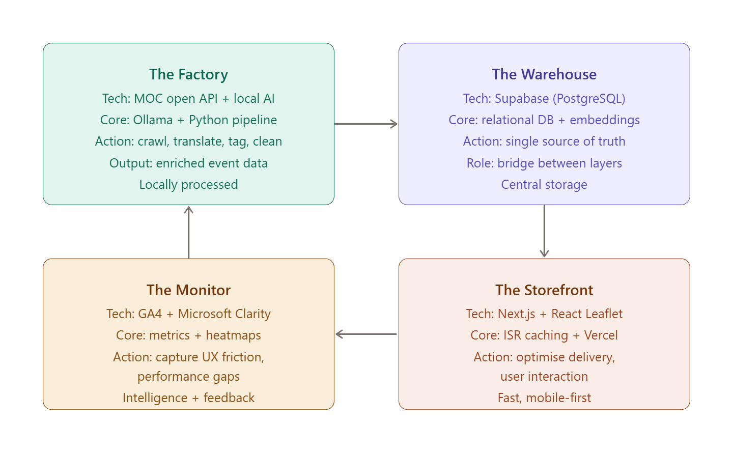
Data processing pipeline
Python periodically scrapes data from government and third-party platforms, then normalizes it and stores everything in Supabase.
A local AI stack (Ollama + Gemma) then processes the content to keep token costs down, including:
- Translating into English
- Cleaning out unnecessary descriptions
- Rewriting it into a more readable format
Front-end presentation
The front end is built with Next.js.
For the map, React Leaflet and Supercluster handle large volumes of event data so users can still operate smoothly on mobile.
Self-updating mechanism
The whole system is designed as a continuous loop:
data fetch → AI processing → database → frontend → usage feedback → update again
Problems during development
Mobile performance
The early version was almost unusable on phones because it loaded too much data at once.
It was improved through a few changes:
- Loading data in layers
- Lazy-loading non-core content
- Adding skeleton screens
- Using ISR caching
That is what finally made the experience stable.
Unstable open-data quality
Using government data in practice surfaces plenty of inconsistencies, for example:
- Missing coordinate information
- Messy address formats
- Inconsistent field definitions
So I built a separate set of:
- Venue-matching data
- A geocoding pipeline
- Data-cleaning rules
Search-system complexity
Search had to handle all of these at once:
- Chinese titles
- Rewritten English content
- The tag system
- Real-time updates on the map
That made it far more complex than ordinary keyword search.
From scattered to usable
If you only look at the result, the change is pretty direct.
The old flow was:
switch between 20+ platforms → can't find it → give up
Now it is:
open the map → see the event → make a decision
A short wrap-up
The system is still kept lightweight, but it already runs reliably. Getting images remains the biggest problem, but it can now accurately pin arts events from every platform onto the map and deliver basic bilingual presentation.
Next steps
A few directions might come next:
- Better recommendation logic
- More complete bilingual content quality
- Finer-grained categorization and filtering