CurioTails:Making a Picture Book with ComfyUI and Qwen3-TTS
Aug 28, 2026 · 6 min read
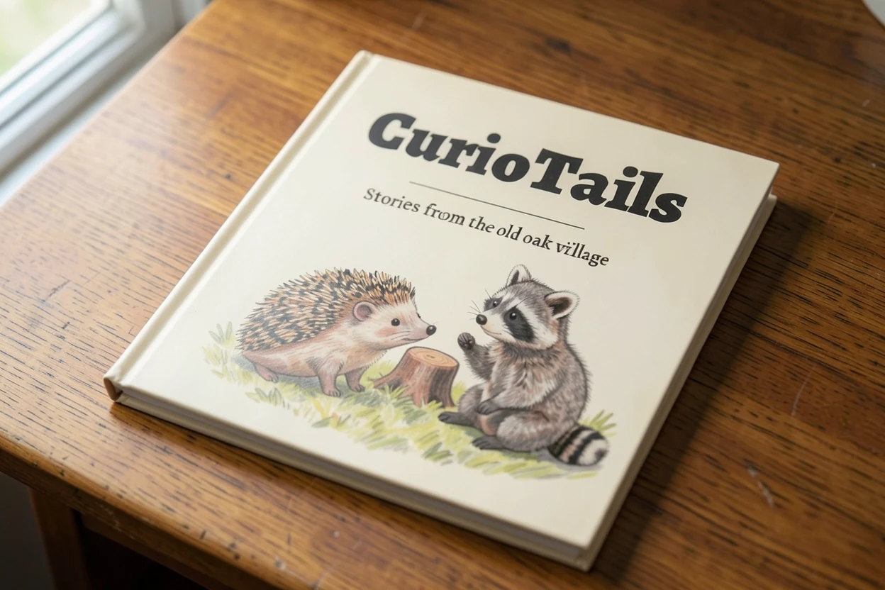
CurioTails is an AI-made audiobook picture book about a cast of colored-pencil woodland animals, and it is still in progress. This post covers the four hardest problems so far: keeping characters consistent, keeping the style from drifting, keeping scenes spatially sane, and making the voices sound natural.
I'm a designer, and I know that hand-drawn art and human voice acting have value that can't be replaced.
Real drawings carry brushwork, accident, and human judgment. A good voice actor does far more than read the words: they understand the character first, then decide on a pause, a tone, even how a sentence should breathe.
So this project was never about proving AI can replace any of that.
What I wanted to know was something else:
If I treat AI as a set of tools that has to be designed, controlled, and repeatedly curated, can it make something that doesn't read as AI slop?
I wanted to make a picture book that can actually be read. Characters with personalities of their own, artwork with one consistent visual language, scenes that follow basic spatial logic, text and illustration that relate to each other, and a voice that doesn't just recite the words mechanically.
And above all, the final judgment still belongs to a person. AI can generate a lot, but volume doesn't make work good. To me, the place a designer really intervenes is deciding what stays, what gets thrown away, and how to build a process where the good results repeat reliably.
That is the main experiment of CurioTails. I treat it as a small AI production system: characters, style, scenes, and voice. The things that used to rely on craft intuition get split apart, measured, and put back together.
This post covers the four problems that took the longest: character generation, style consistency, scene composition, and voice design.
TL;DR
- Goal: A picture book series with a fixed cast of characters. Each episode tells one story and introduces one idea, and the same artwork extends into narrated videos, vertical shorts, and a print book.
- Approach: Let two image models each do what they're best at: one handles structure, the other style. Lock the overall look before building the characters. Split every page into independent layers, so changing one part never means redoing the whole page.
- Outcome: Four stable characters, a page-composition system, and a set of automatic checks that catch common mistakes before a person ever has to review the art. Episode one is currently in production, page by page.
The project in one minute
The fastest way to picture CurioTails: a slower, simpler Magic School Bus. Each episode introduces one concept, each page holds at most three focus objects, and the story is carried by four woodland animals: a hedgehog, a raccoon, a fox, and a skunk.
But the thing that shaped the whole production is a very practical constraint: the same artwork has to work as a long video, as vertical shorts, and as a printed book, and it has to support more than one language.
So from the start, every page is split into four independent parts: background, characters, text, and sound. Change one line of dialogue, and you only re-set that text and re-record that one clip. Nothing gets redrawn.
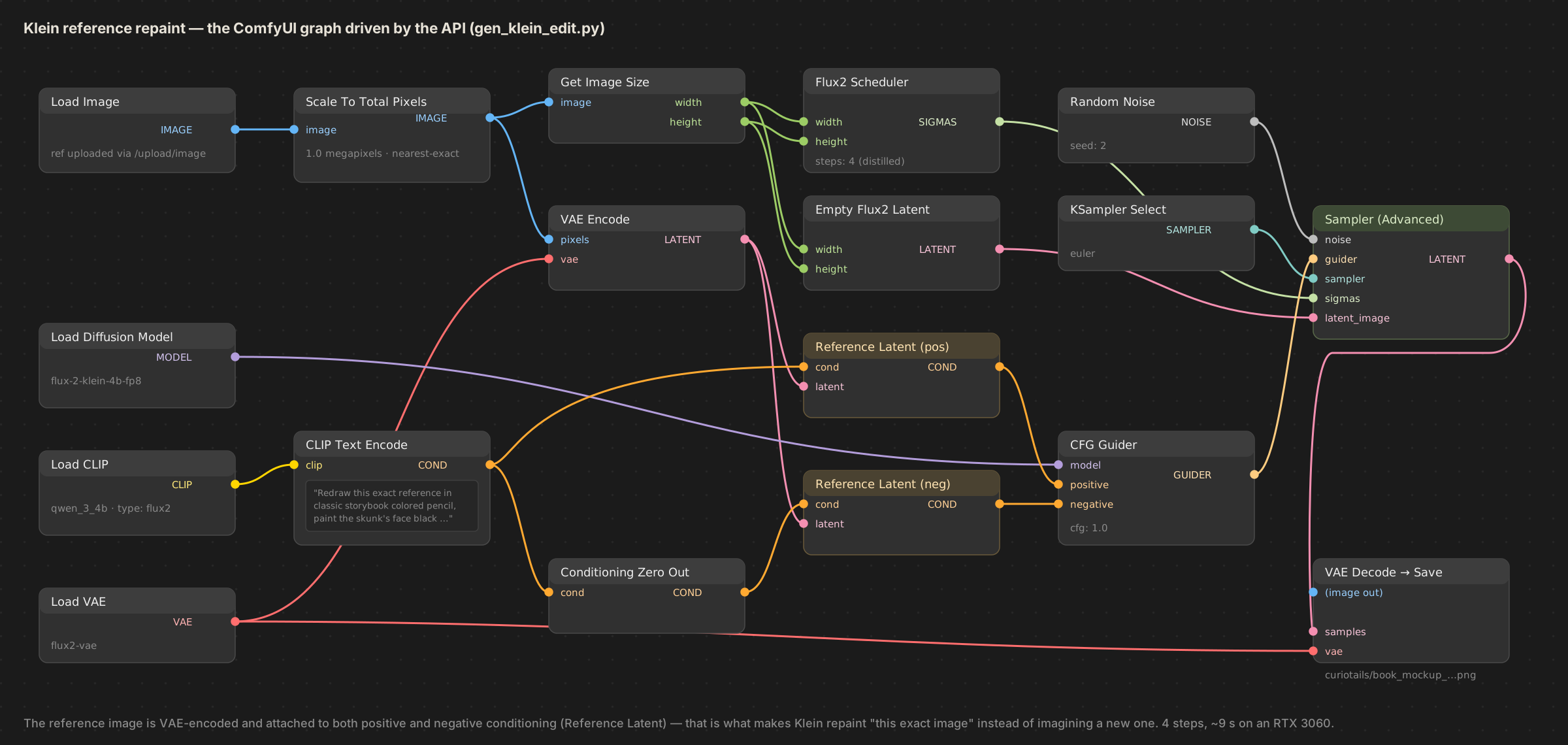
Everything runs locally on one consumer GPU: images are generated through ComfyUI (driven by its API, with Z-Image, FLUX.2 Klein, and custom LoRAs), and every voice comes from Qwen3-TTS.
Characters: let each model do what it's best at
I quickly found that no single model did everything well.
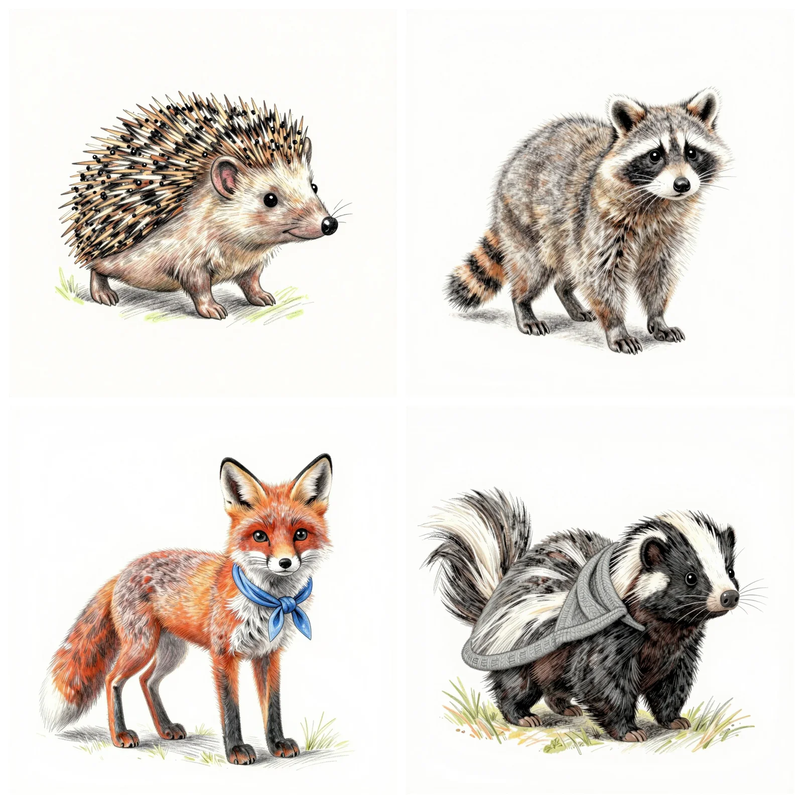
Z-Image is better at structure. The animals it generates usually follow basic anatomical logic, and the poses feel natural. But its default look is too realistic for a children's book.
Klein is better at style. It can paint the classic storybook look I wanted: soft watercolor with fine pencil lines, somewhere in the spirit of Beatrix Potter. But I didn't want it to also be responsible for a character's body structure.
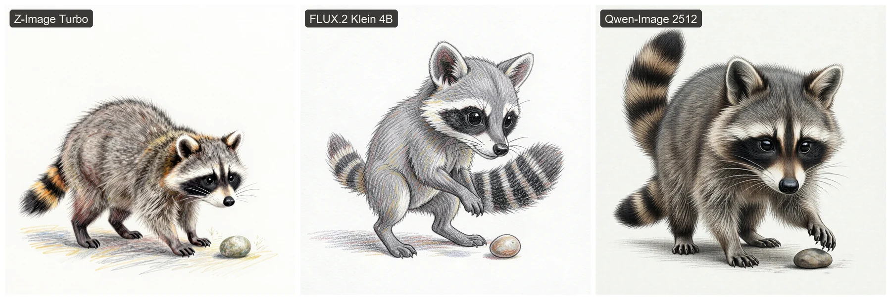
The reason Qwen didn't make the cut is practical: its results trail Z-Image only slightly, but the model is much heavier and noticeably slower to generate with on my card. And at this stage all I need is a structure draft for Klein to work from, so Z-Image is enough.
So the final pipeline works like two artists with different specialties passing work along a desk:
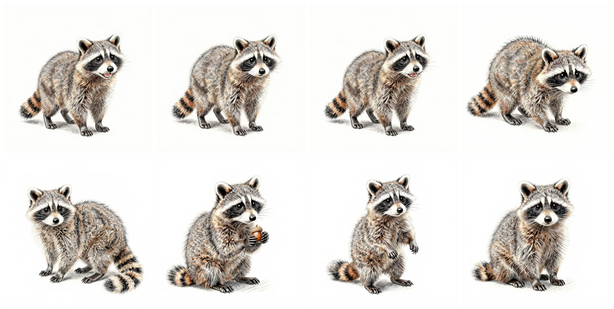
- Z-Image sketches first. Each character is generated in twelve poses, two versions of each, and a person picks the good ones.
- Klein takes over the style. The keepers are repainted into the storybook style, using the sketch as a reference. This step also takes instructions, like "paint the skunk's face solid black" or "remove the grass", so details the sketch got wrong get fixed here.
- A LoRA locks the character in. The repainted set becomes the training data for a small custom model per character. After that, the character keeps the same recognizable features in any pose, in any scene.
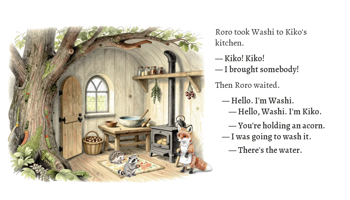
The result is a cast of four: Roro the hedgehog, Washi the raccoon, Kiko the fox, and Ponder the skunk. Two kids, two elders; one earnest and one playful in each pair.
Each character also has a fixed voice. Tap a line to hear them, including some of the emotional takes from the casting session. How these voices are directed is covered further down.
Washi · raccoon
Voice: sohee, directed up into a child's range.
Roro · hedgehog
Voice: ono_anna, bright and always slightly too loud.
Kiko · fox
Voice: ryan, a warm unhurried grown-up.
Ponder · skunk
Voice: serena, slowed to a deliberate calm.
Consistency: start from where AI goes wrong
The characters look simple, and that's deliberate.
Every rule in the character design exists because I watched AI break something:
- No clothes, no accessories. Accessories are the first thing to drift between images. A scarf changes color, changes size, or simply multiplies. (The two elders later earned one garment each, a plain neckerchief and a plain shawl. Both are soft, single-color, and pattern-free precisely so they can't drift.)
- No complex patterns. A plaid or floral print gets reinterpreted every time, so the model ends up treating that area as something that can vary randomly.
- Solid bead eyes, no whites. A classic picture-book convention, and it removes a whole category of broken-gaze problems. Emotion moves to the brows, mouth, ears, and posture.
- Count everything. Four legs, two ears, one tail, written straight into the prompt and then checked one by one. It sounds excessive, but counting is the most reliable way to catch an extra paw.
With accessories gone, recognizability rests on three things AI can hold steady: silhouette, size, and color. The four outlines look nothing alike; the elders are about twice the size of the kids; and the colors are grey, chestnut-and-cream, orange, and black-and-white.
There is one ordering rule that mattered just as much:
Lock the style before building the characters. A LoRA learns the character together with the visual style it lives in. Decide to change the style after the characters are trained, and every character has to be retrained.
So I ran four style tests first, with the same scene and the same seed, and committed to a direction before generating any training data. I chose D: classic storybook, watercolor with fine pencil lines. Every character was then trained against that style.
Scenes: treat a page as a stack of layers
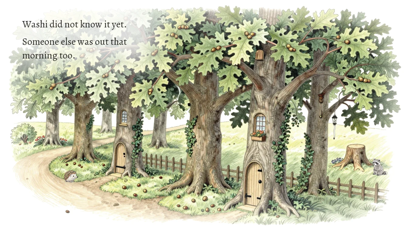
A page can stay on screen for one or two minutes in the video. A single static image would go flat, so each page is treated as a stack of independently adjustable layers, and the picture changes in small beats: the character swaps pose, the camera drifts, text appears, a sound comes in.
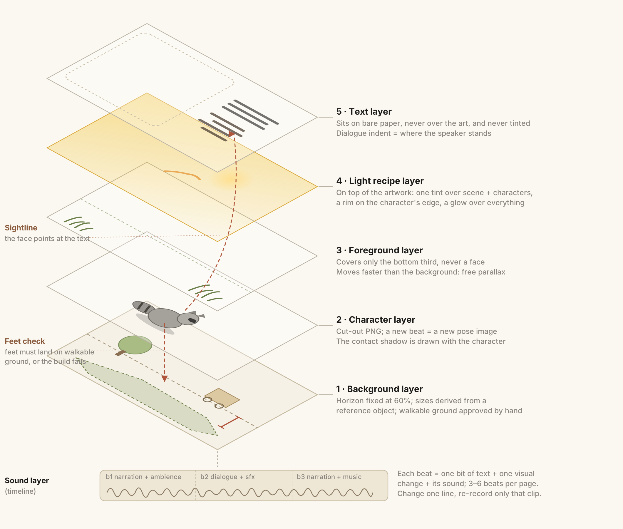
From the bottom up, a full page is roughly:
- Background: horizon fixed at 60%; sizes derived from a reference object; walkable ground approved by hand.
- Characters: cut-out PNGs; each new beat can swap in another pose; the contact shadow stays with the character.
- Foreground: covers only the bottom third, never a face; moves faster than the background for parallax.
- Light: one tint over background and characters, a warm or cool rim on the character only, a glow over everything.
- Text: sits in the paper margins; never tinted by the scene; dialogue indents follow the speaker's position.
- Sound: narration, dialogue, effects, ambience and music, on a timeline of beats.
Each beat is one bit of text, one visual change, and its sound; a page has about three to six of them. The biggest payoff is simple: change one line, and you only re-record that line. Never the whole page.
When AI generates scenes, what actually breaks the spell is usually a lack of plausibility. A character floating above the floor, standing on a tree root, or drawn at the wrong size reads as wrong instantly. Three rules fix most of it:
- Never eyeball sizes. Every background is measured against an object of known size, like a stool or a table, and character sizes are calculated from that. If the fox comes out two stools tall, the math says so before anyone has to notice.
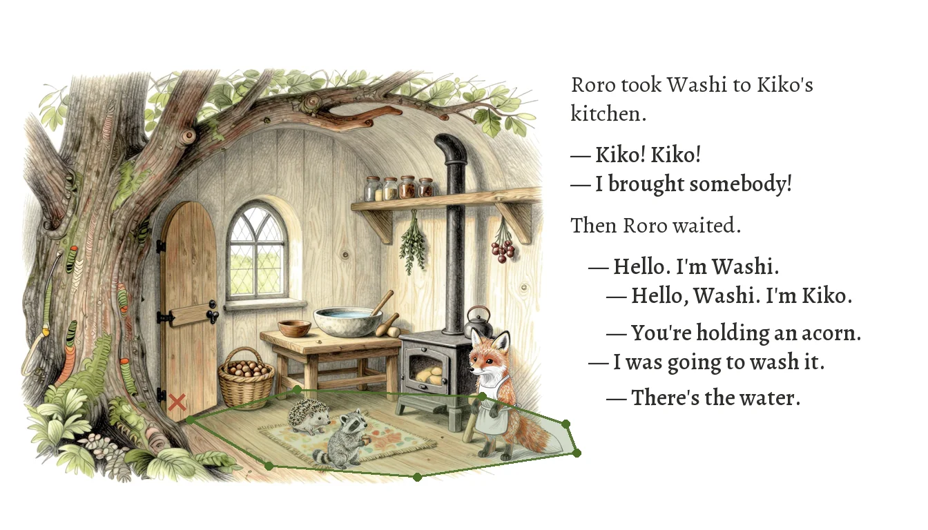
- Never eyeball positions. Every background has a human-approved "walkable ground" area. If a character's feet land outside it, the page build fails with an error, so a raccoon never ends up standing on a doorstep.
- Don't paste shadows on afterwards. I used to add a soft ellipse under each character, and it always looked like a sticker. Now the shadow is generated together with the character and kept in the cut-out.
Light gets its own layer too
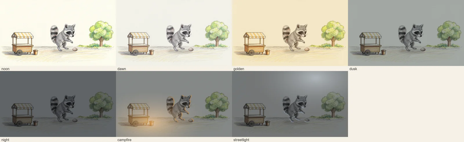
I never paint firelight into a character's image, because that would chain the image to one scene forever. Instead, each scene has a light recipe: an adjustment layer that sits on top of the finished artwork, just under the text. It is made of a tint applied to background and characters with the same settings, a warm or cool edge on the character only, and a glow over the whole scene.
The same character and the same background can then switch between noon, dawn, golden hour, dusk, night, campfire, or streetlight. The artwork itself never changes. Light is just another replaceable layer.
Multi-character scenes: don't let the model guess scale
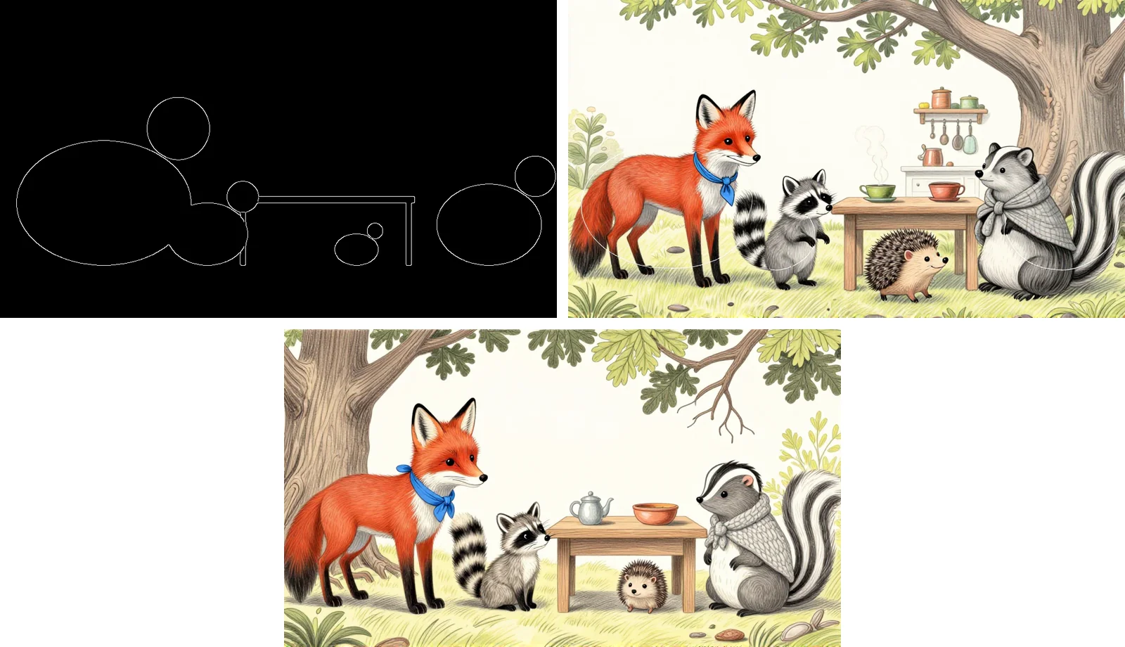
With several characters in frame, I stopped trusting the model with proportions. It tends to draw everyone at a "comfortable" size, which is fine alone and wrong together.
So the composition is locked with a block-out first: a few ellipses and a table establish the spatial relationships, and the model generates the full scene on top of that structure.
I also tried describing proportions in words, like "the hedgehog only reaches the fox's paw". It wasn't reliable: in one image the hedgehog came out tiny, in another it disappeared entirely. The block-out controls position and size far more steadily.
Text shouldn't sit on the art
The text treatment got redone once. My first layouts used a semi-transparent caption bar, and it made every page look like a video game with subtitles.
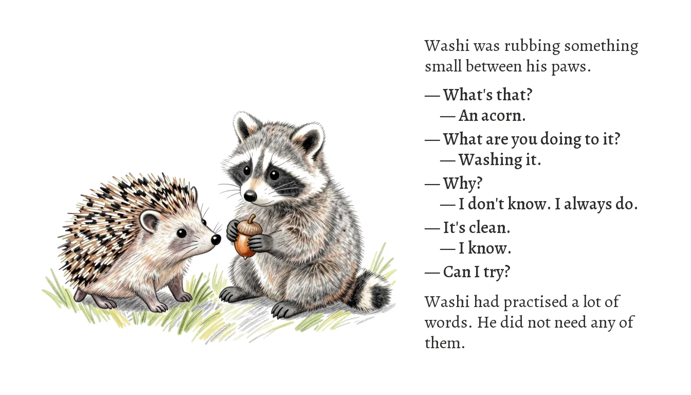
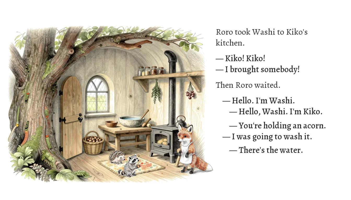
Now the text lives in the real paper margins, placed on the side the character is looking toward. The reader's eye travels naturally from the character to the words, and on toward the next page.
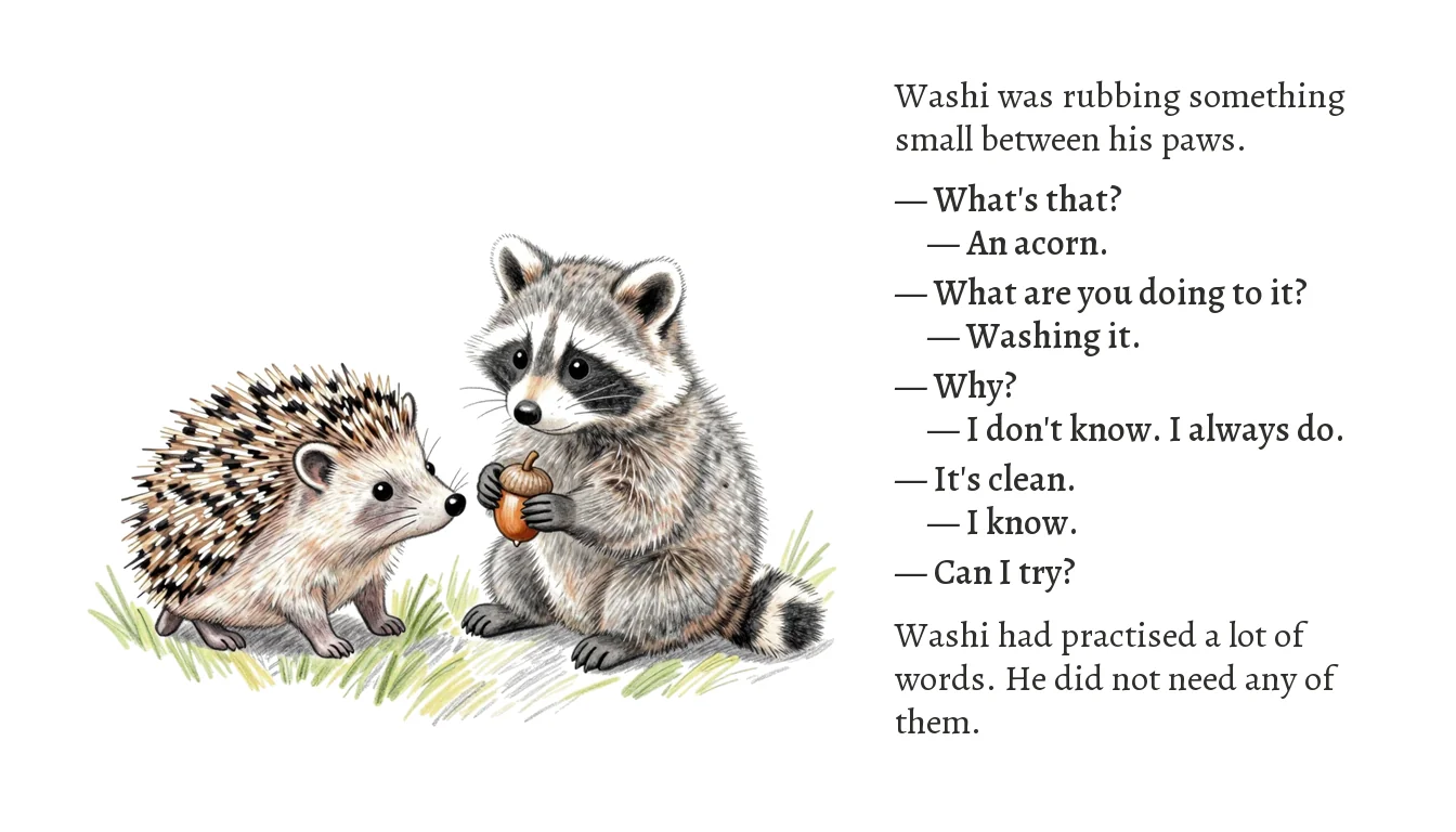
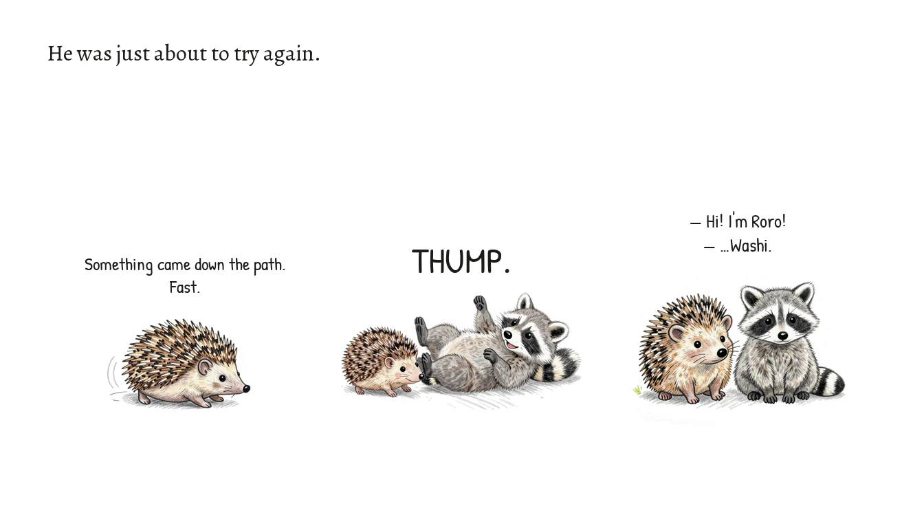
Dialogue drops the name tags entirely. If the animal on the left of the picture speaks, the line sits flush-left; if the one on the right speaks, the line is indented. The alternating indent itself becomes the visual rhythm of a back-and-forth conversation.
Voices: picking the right voice beats writing more direction
Every character has one fixed voice, generated locally with Qwen3-TTS. The model has no real child voices, so age is carved out of pitch: the same voice reads grandma low and the little raccoon much higher, and it lands convincingly in the range of a real five-to-seven-year-old.
The most important thing I learned about directing TTS:
The longer the instruction, the worse the reading. To quantify it, I defined a drag ratio, which measures how much longer a clip runs than its word count justifies (1.0 means natural pace):
- Short instruction, one do and one don't: 1.17
- Minimal instruction ("native accent"): 1.31
- Detailed accent notes: 1.46
- Plus a voice-actor persona: 1.80
Under the longest instruction, the worst clip stretched to 24 seconds. Detailed direction makes the model perform carefully: vowels stretch, line endings trail off. I even caused the mystery breathing noises ourselves. The prompt said "natural breaths at the punctuation", which to the model is simply a request for breath sounds. The final direction is four plain sentences, and nothing gets added to it.
Casting beats directing
Tone control hit the same wall. I asked a narrator to "keep the pitch calm", and the reading got more dramatic, because any mention of pitch is understood as "please perform pitch".
Instructions can shape a performance, but they can't restrain one. What actually works is casting: under identical instructions, the calmest available voice showed a third of the pitch swing of the most theatrical one. Pick the right voice first; write prompts second.
Where Qwen3-TTS hits a wall: accents
One limitation I never fully solved: every built-in voice carries a slight accent in English. I first tried to write it away with instructions, and that is the drag-ratio story above. Then I tried VoiceDesign, which builds a voice from a written description instead of a preset.
VoiceDesign can sound convincingly native, but consistency is very hard to hold: the same description and the same line can come back as a noticeably different voice. For a character who has to sound like themselves across a whole season, that is disqualifying.
So the cast stayed on the built-in voices. Every character keeps a faint accent, and I judge it acceptable for now. A few artifacts from those test sessions:
Test: instruction length
The same line, the same voice, three instruction versions.
Test: VoiceDesign consistency
The same written description, the same line, three takes.
Punctuation is the real tempo control
The same sentence reads in 5 seconds with plain punctuation, and in 11 seconds with ellipses and dashes.
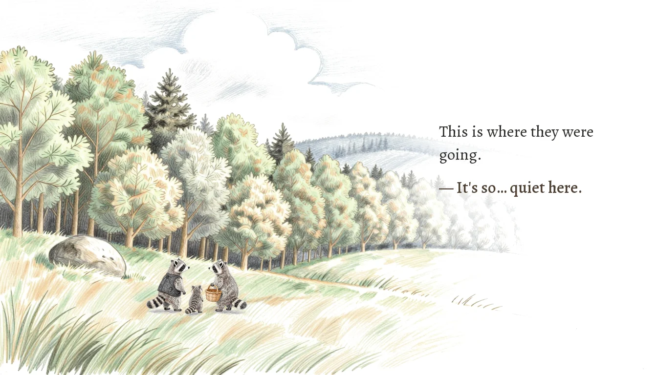
So the on-screen text and the voice script are two separate documents. The page keeps "It's so… quiet here." for the reader's eye; the voice script gets a comma, and the pause is handled in the edit.
Automating the quality check
Every clip is checked automatically. Whisper transcribes the audio back and flags missing or extra words; simple acoustic checks catch breath noises and dragging. Past a threshold, the clip regenerates, up to four tries.
The narrator gets one extra step: each line is generated three times, and the take closest to the season's reference recording wins.
Three practices I'd use again
1. Give different models different jobs
Draft with the model that understands anatomy, restyle with the model that understands the look, then lock identity with a LoRA. Each model only does what it's best at.
2. Choosing beats prompting
For images and voices alike, piling on instructions usually makes results worse. Generate a few candidates under short instructions, and spend the effort on selection instead: seeds, takes, voices.
3. Turn "looks right" into something measurable
Walkable-ground checks, size math from reference objects, drag-ratio thresholds, transcription diffs. All of it can be checked by the system.
Taste still needs a person. But everything below taste should be checked automatically, and fail loudly when it's wrong.
An ongoing project
CurioTails is very much a work in progress. Episode one is being built page by page, and each page usually goes through several rounds of review and redrawing before it counts as finished.
One more constraint shaped every decision above: I want the whole pipeline to run on local models, and my card only has 12GB of VRAM, so a lot of choices were made inside that budget. If I ever open the pipeline up to cloud services, I would try Nano Banana for some of the imagery, and ElevenLabs for the music and the voices.
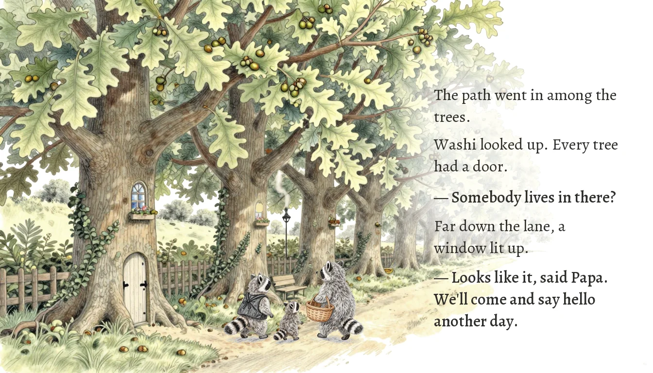
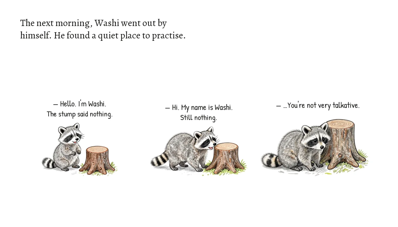
Here are the pages finished so far. The page-by-page build keeps producing its own lessons, about foreshadowing, page turns, and continuity, and those will become a follow-up post.
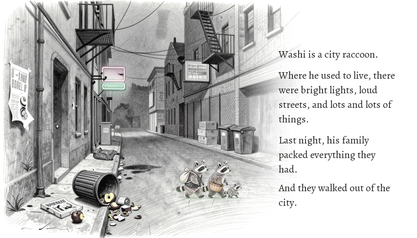
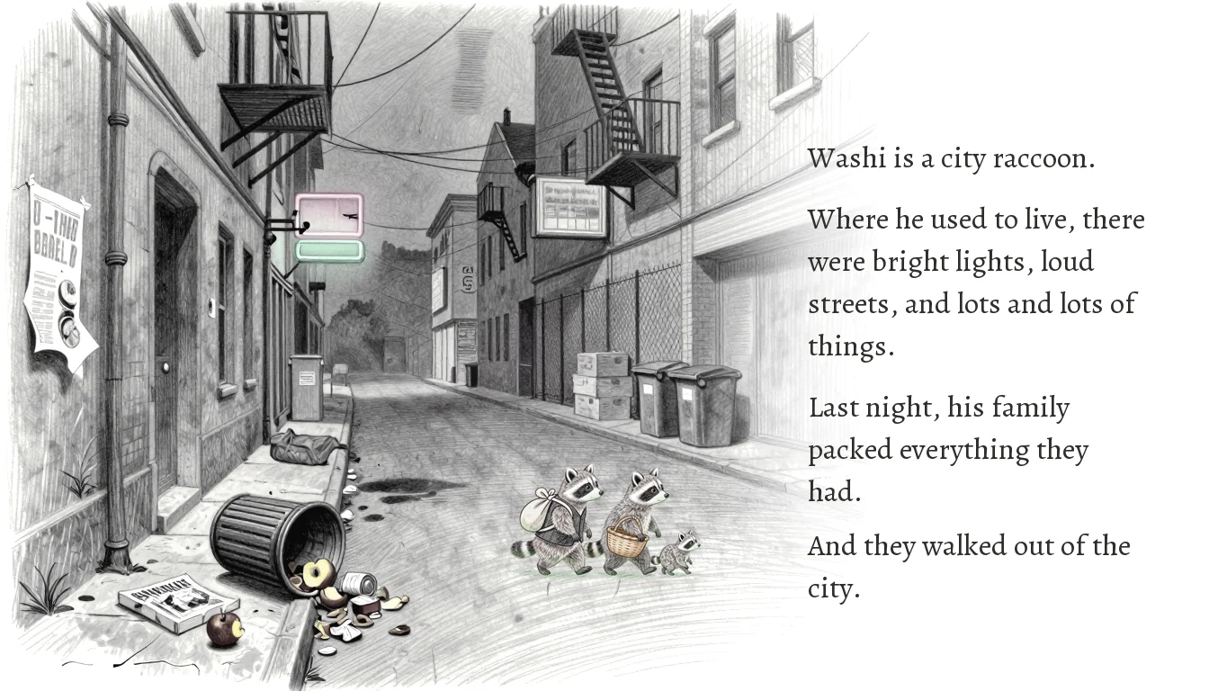
Page 1: Washi's family leaves the city.