Back

Art Market Insights Platform: A business model experiment

OVERVIEW

Overview

Art Market Insights Platform is a seven-day, self-initiated redesign concept. It builds on an existing art-market research product to explore one question: if art-market research no longer only served a small number of professionals, but let more people understand the market faster, what would the product become?

The original product centers on auction data and provides deep analysis through custom research reports. But after re-examining the product experience and existing content, I found the platform had already accumulated a large body of art-market information, including auction records, news trends, exhibition information, artist profiles, and research articles.

The problem isn't a lack of data. It's that this content is spread across different systems and pages, so users often have to search, organize, and compare it themselves to slowly build a complete understanding of the market.

So this redesign proposes a new direction: if the existing content were consolidated into a single research entry point, and the business model and data experience rethought at the same time, could the product serve more kinds of users and research situations? The exploration spans product positioning, the business model, a reworked information architecture, and concept validation (POC) through a high-fidelity interactive prototype.

Role
Product Designer
Timeline
7 days
Team
Solo project
View the live prototype

DISCOVER

A deep content base, yet scattered across the platform

In art-market research, auction price is usually the most immediate and accessible information, so the existing product is built heavily around auction data. But after walking through the whole flow again, I noticed a few things worth rethinking.

From search to analysis result takes too many steps

The current access runs on subscriptions and credits. A user has to enter the database, submit a request, then wait for the analysis team to respond. The model suits deep research, but it limits those who just want to grasp the market direction quickly, or start exploring.
Price is only one market signal

A sale price matters, but it is usually only part of the market outcome. A work's exhibition history, provenance, cultural context, and market attention all shape how its value is understood. And most of this already exists on the platform, just filed under different content and entry points.

Rich content, but research is still fragmented

Beyond auction data, the platform has also built up a lot of news, exhibition records, research articles, and artist data. But when a user wants to dig into a single topic, they still have to switch between pages and organize the information themselves.

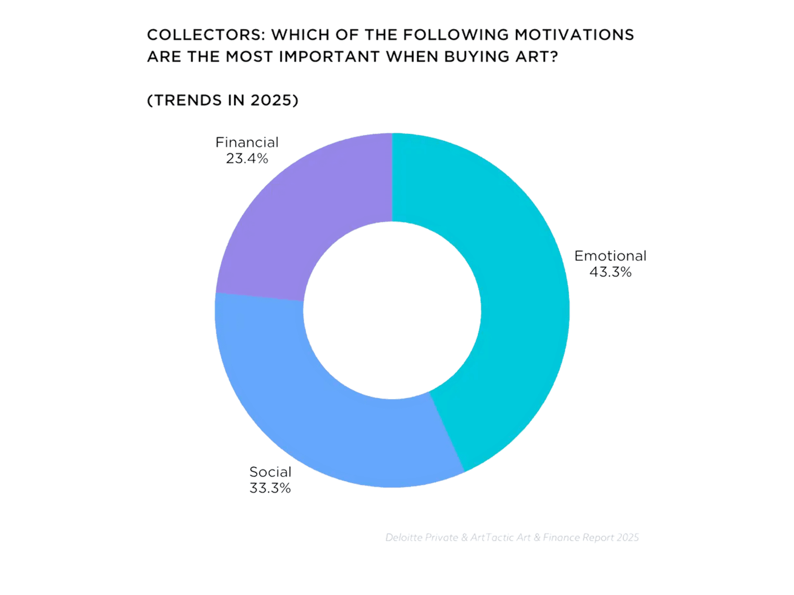
A pie chart of collector motivations in 2025: emotional drivers 43.3 percent, social factors 33.3 percent, financial considerations 23.4 percent.
Financial motivation accounts for only part of a collecting decision; the rest of the value is shaped largely by exhibition history, provenance, and cultural context. Source: Deloitte Private and ArtTactic, Art & Finance Report 2025.
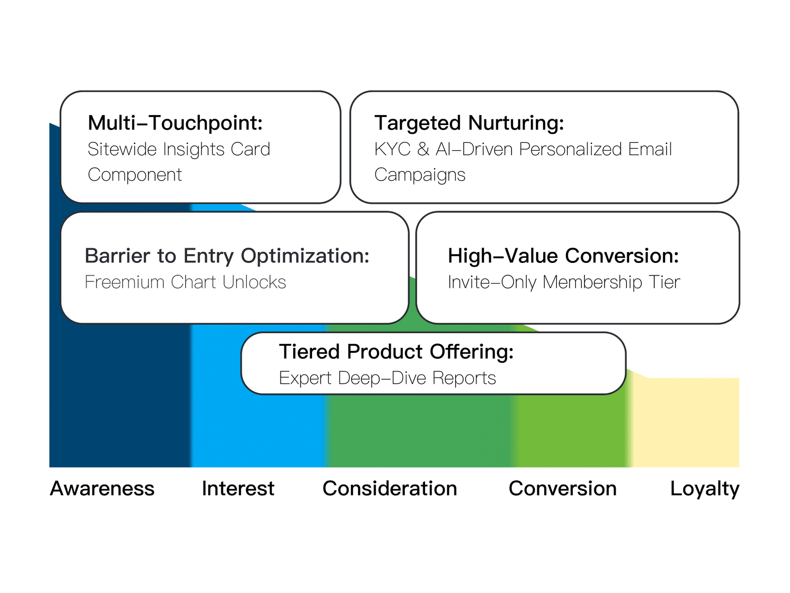
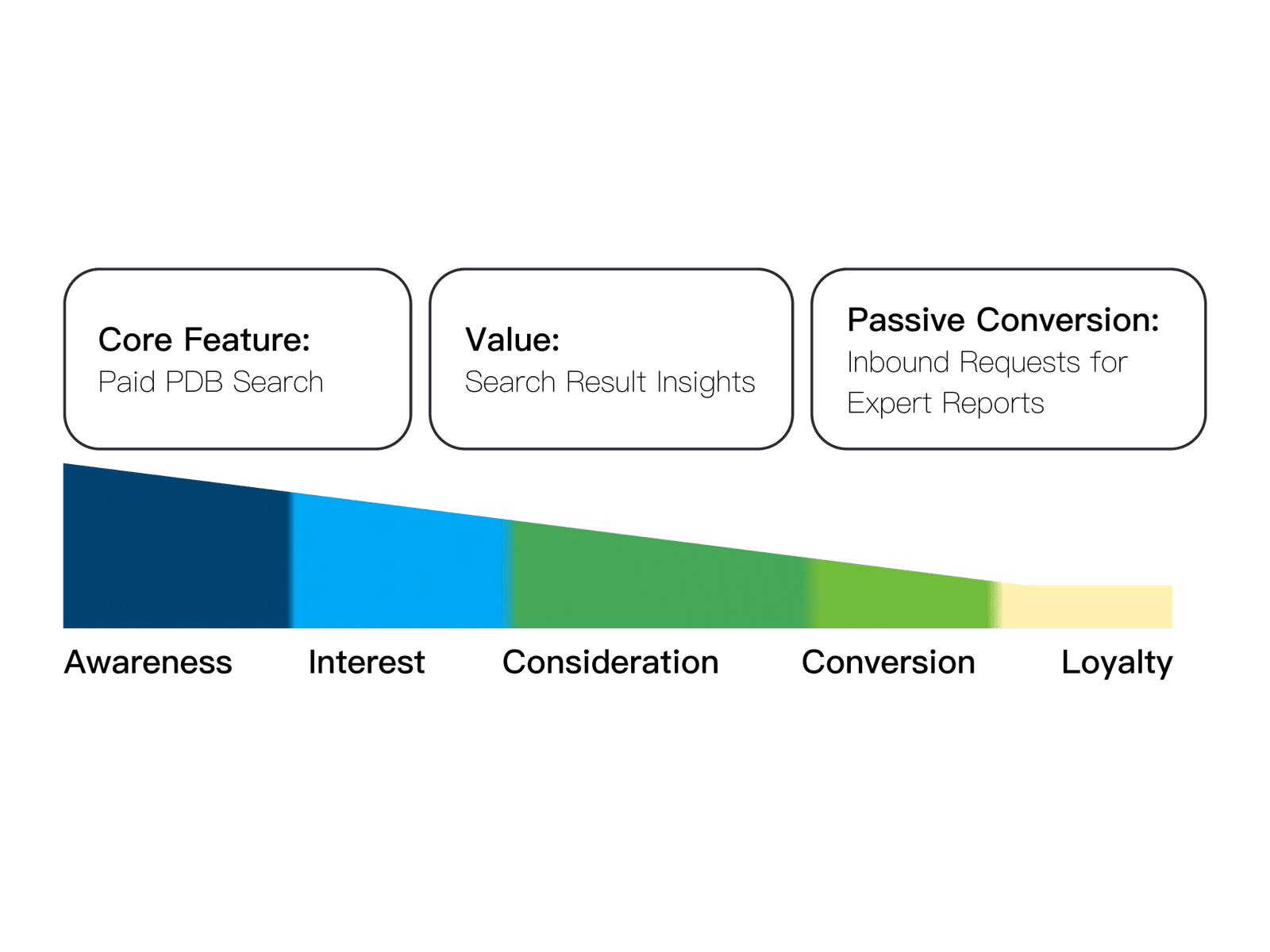
The legacy marketing funnel: paid database search as the core feature, the insights in search results as the value, and passively received expert-report requests as the only conversion point.
The redesigned funnel: a sitewide Insights Card, free chart unlocks, tiered expert reports, and invite-only membership.

The legacy funnel: paid search at the core, with conversion relying heavily on users requesting reports themselves.

Initial insight

It gradually made me realize that what is really missing might be the connections and context between data.

DEFINE

Reframing the problem into a design direction

Problem statement

When I research beyond price, I want non-price signals too, so I can understand what really shapes a work's value.

HMW

How might we add non-price indicators to the existing analytics, and make them meaningful for users with different goals?

The goals and principles below set the scope: reorganize the existing content into a new research experience, and test whether that opens a new business model.

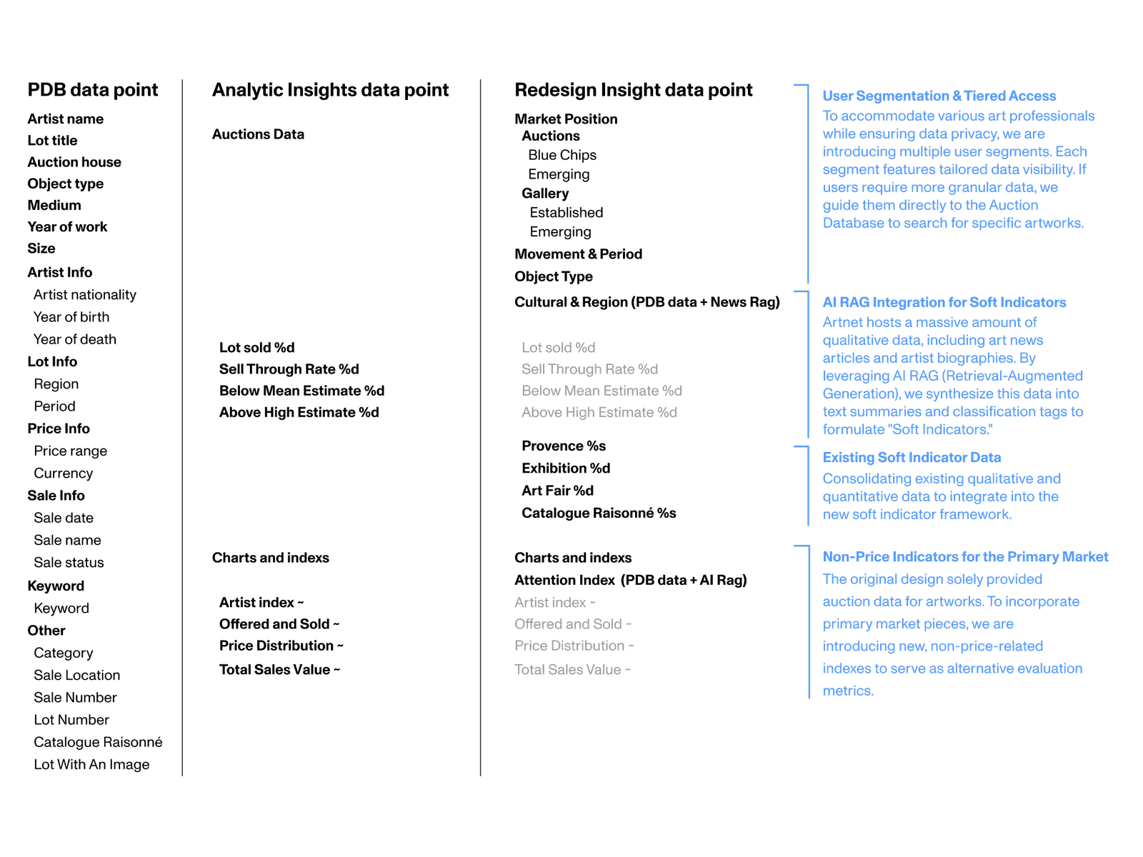
A three-column data-point audit mapping existing database and Insights fields to a redesigned set of signals, annotated with notes on tiered access, AI RAG soft indicators, and primary-market metrics.
Consolidating the platform's existing information to identify and redefine the usable data nodes.
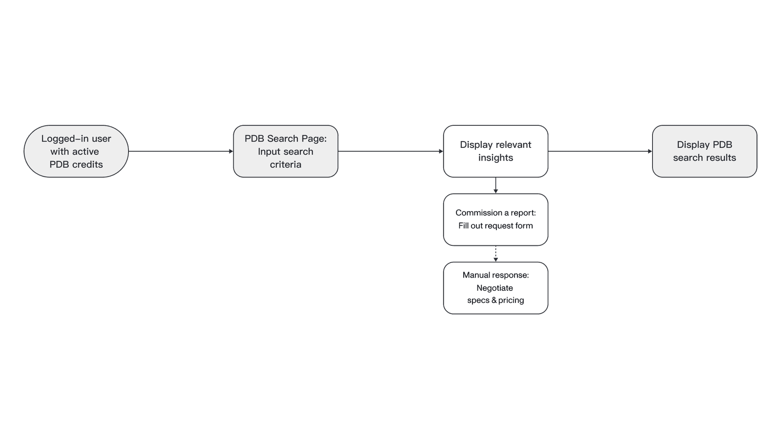
The legacy user flow: a logged-in user with database credits inputs search criteria, sees relevant insights, then fills out a request form to commission a report and negotiates specs and pricing manually.
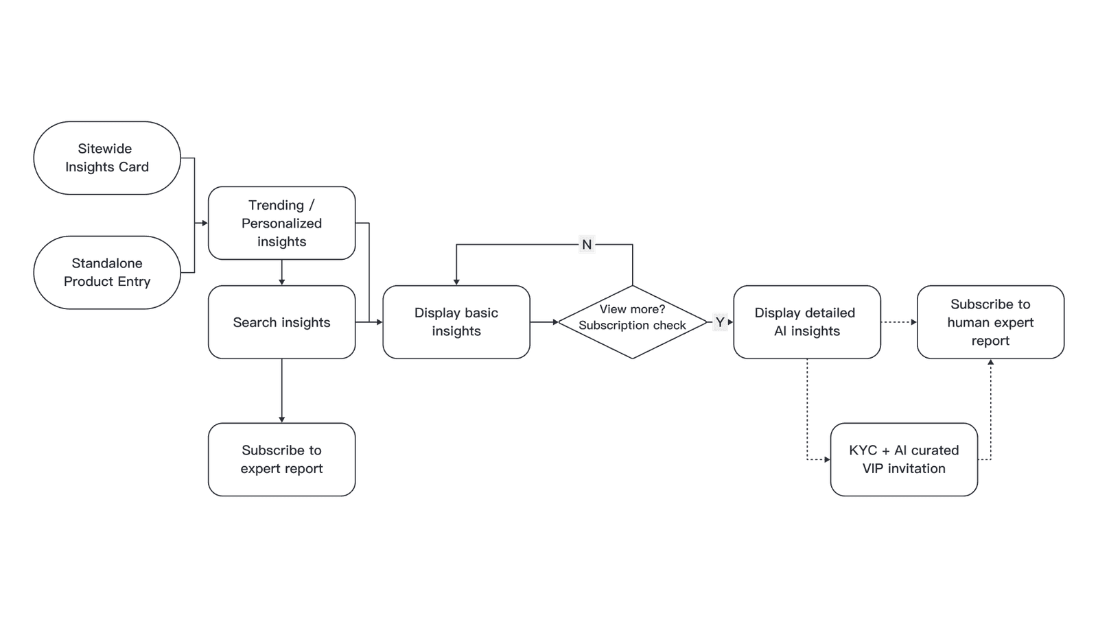
The redesigned user flow: a sitewide Insights Card or standalone entry leads to trending and search insights, basic insights, then a subscription check that opens detailed AI insights, an expert report, and a KYC-curated VIP invitation.

The legacy user flow: after searching, users fill out a form to request a report, which the internal team then handles manually.

Design goals

  • Lower the barrier to viewing and use, so more users can start researching the market without needing a professional background first.
  • Break down information silos, so scattered content becomes searchable, comparable, and easier to put in context.

Design principles

  • Keep the depth and detail professional research needs.
  • Improve exploration efficiency and reduce reading load.
  • Turn unstructured content into usable research signals.
  • Introduce AI as a tool for organizing and connecting information.

DEVELOP

Building the design system systematically

A color system that connects the ecosystem

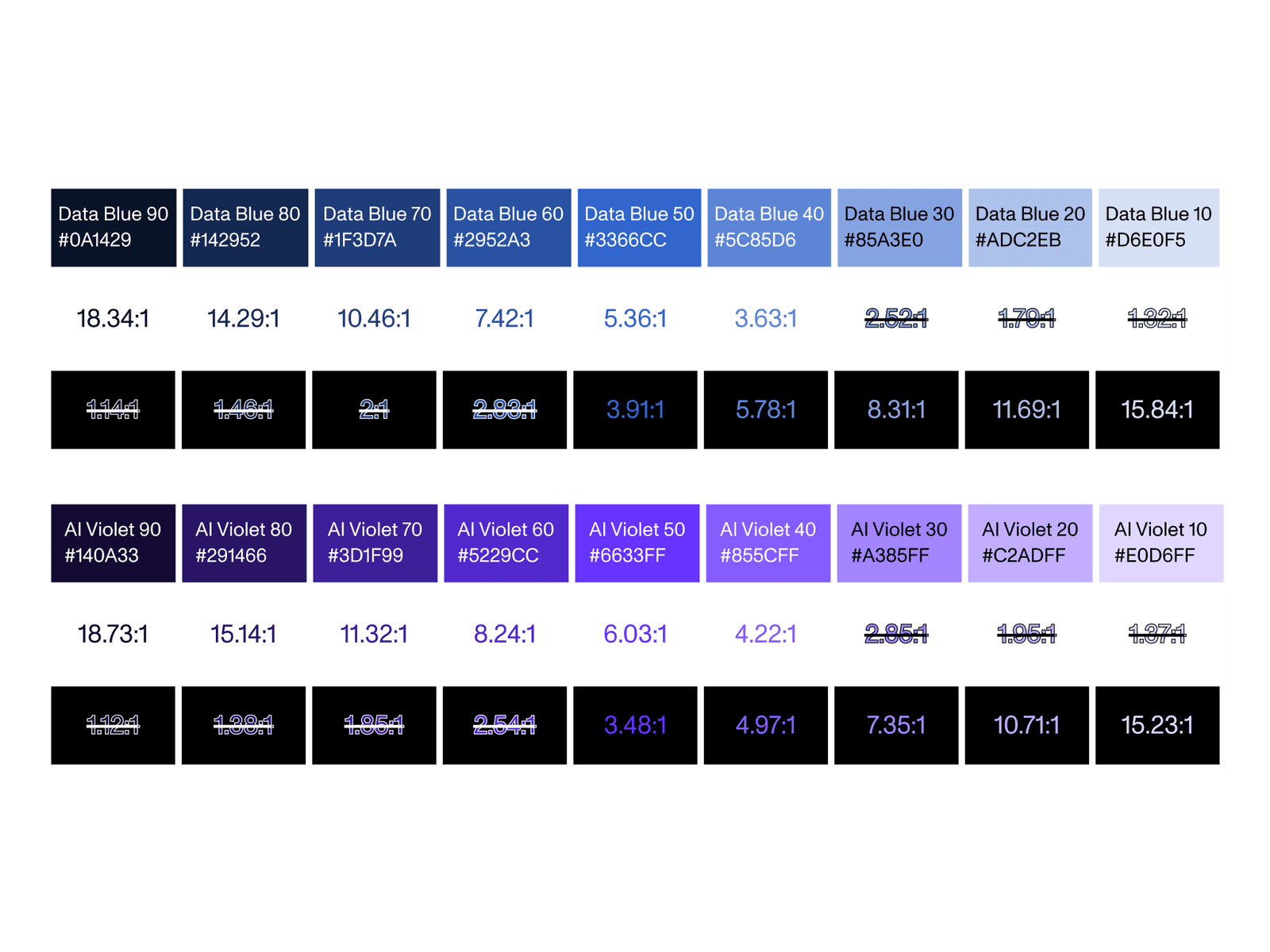
To help users quickly recognize where information comes from and what a feature does, the system extends two core colors into a complete set of semantic ramps. Data Blue handles all market and data content, AI Violet stands for the AI-assisted analysis features. Every step passes a contrast check against dark and light backgrounds, keeping reading consistent.

Two data-color token ramps, Data Blue and AI Violet, each annotated with hex values and contrast ratios on dark and light surfaces.
The semantic color ramps extended from Data Blue and AI Violet, with the contrast ratio for each step carefully labeled and corrected.

Different research entry points for different roles

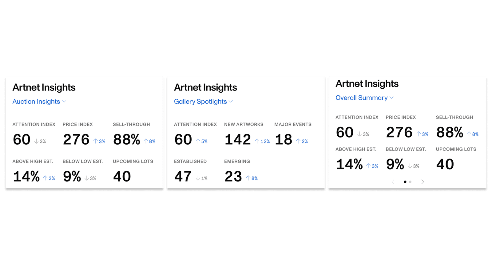
After the redesign, the Insights Card is split by perspective into Auction Insights, Gallery Spotlights, and an Overall Summary, so galleries, collectors, and market researchers can start from the angle that fits their own needs, instead of facing a wall of raw data first.

The site-wide Insights Card in three forms: Auction Insights, Gallery Spotlights, and an Overall Summary.

Old and new design, compared

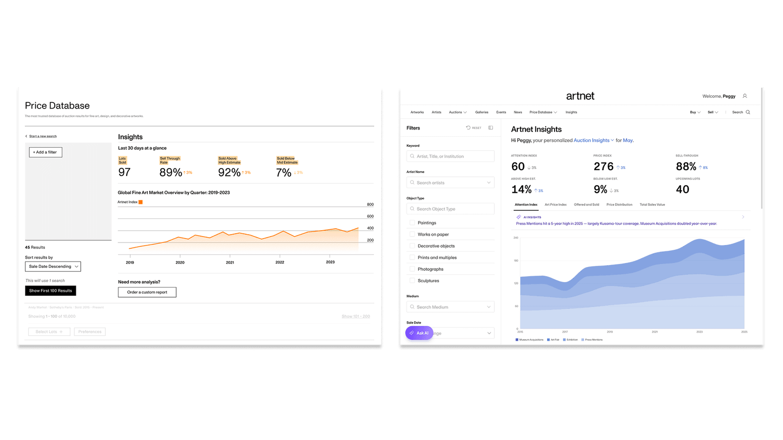
Placing the redesigned version alongside the old one: the new direction adopts a higher-contrast color scheme and refines the interaction logic of the filters, so power users can control each dimension more intuitively and smoothly.

Side-by-side of the legacy auction-only insight, left, and the redesigned all-site Insights dashboard, right.

Keep high information density, but lower the cost of understanding

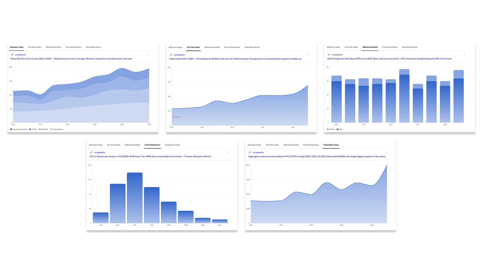
The core users still include gallery operators, auction specialists, art advisors, and investment institutions. So the interface doesn't deliberately reduce the amount of information; instead it reorganizes the information hierarchy, the filter interactions, and how charts are read, so multi-dimensional information can be understood and compared in one view.

A set of chart variations for the dashboard: area, line, and bar charts across several market dimensions.
A chart system that supports cross-dimensional reading and analysis.

Signals beyond price, and an AI way to read them

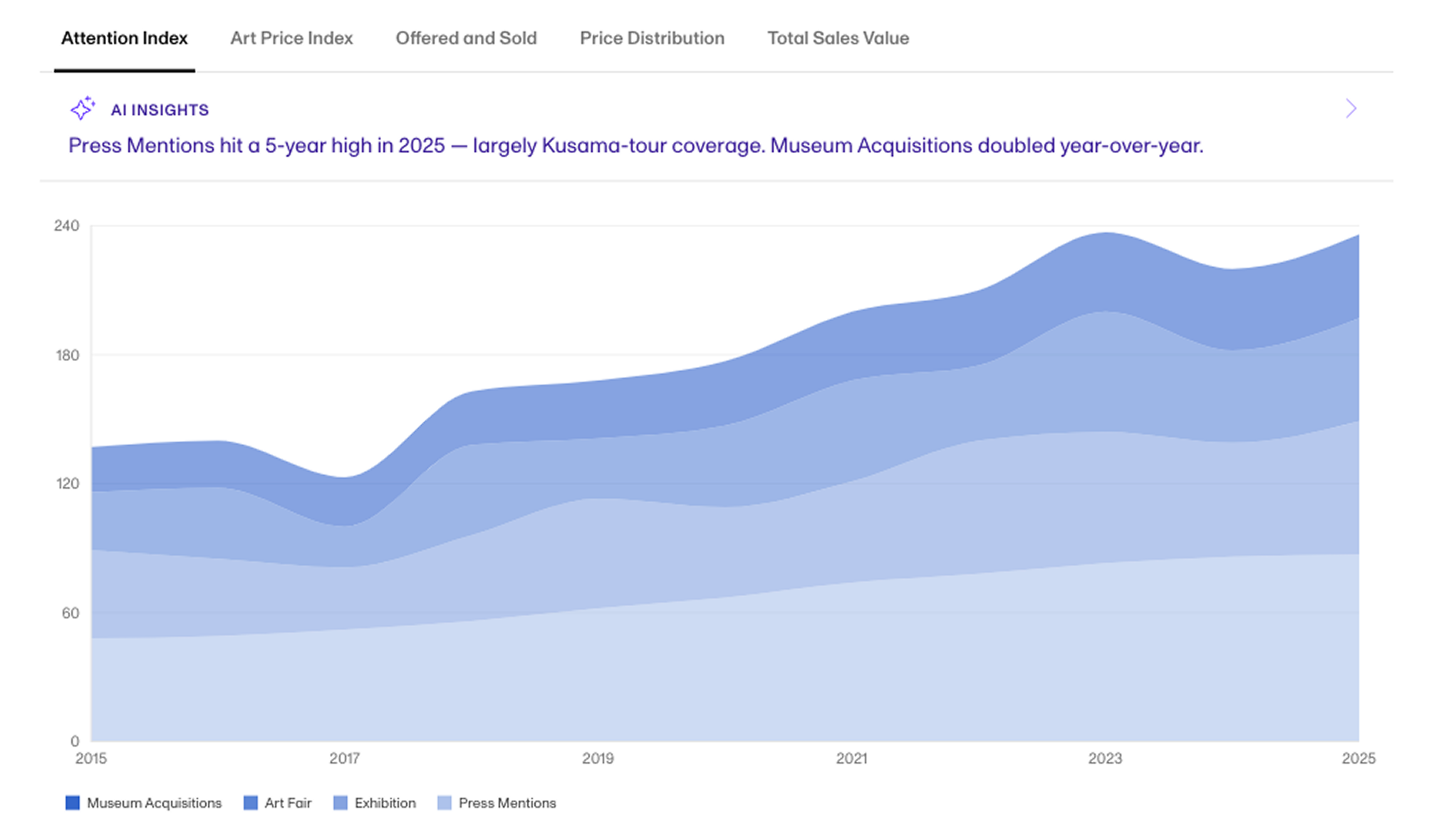
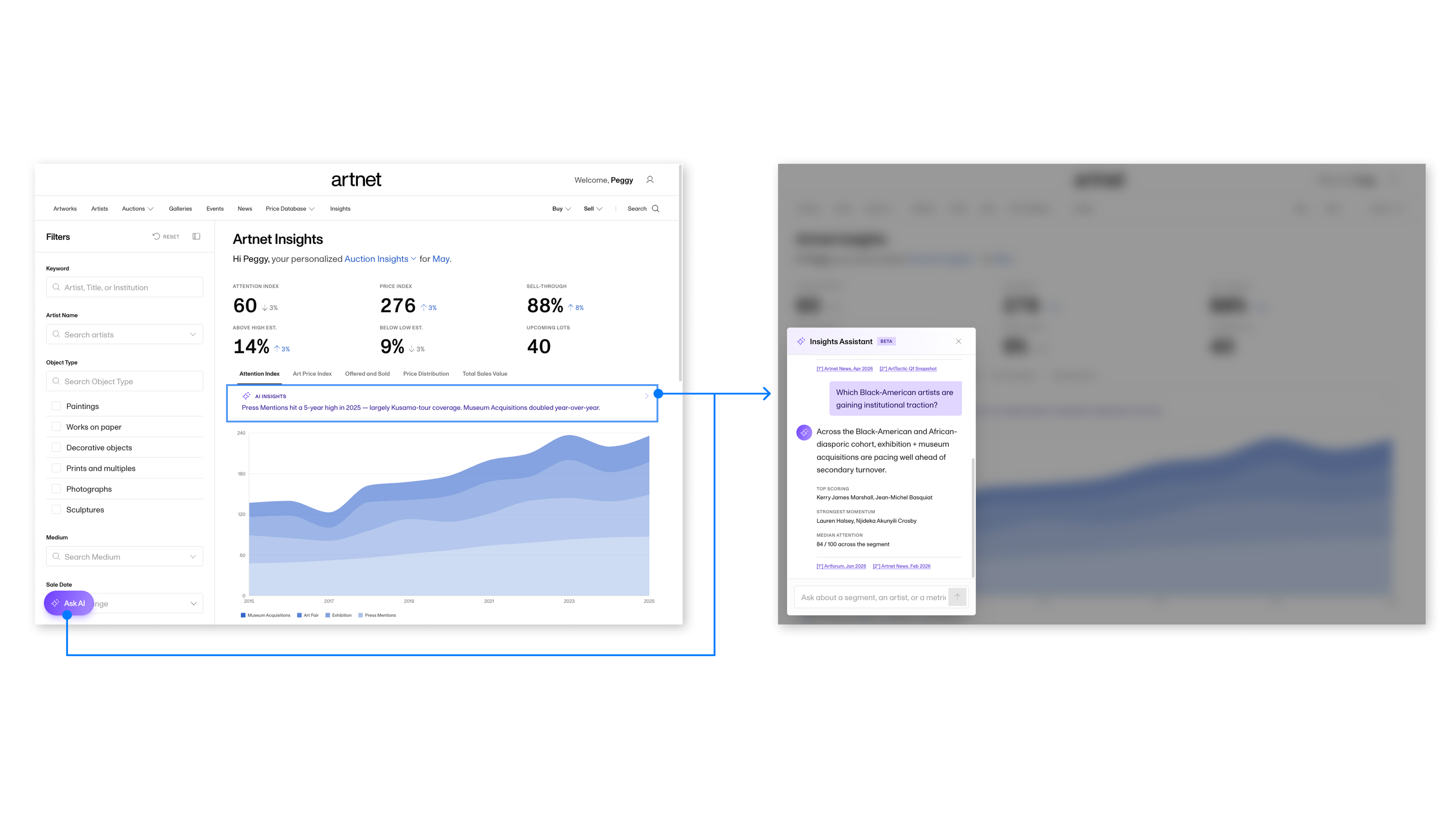
Price is only one outcome, so the redesign surfaces non-price signals too. The Attention Index reads momentum from press mentions, exhibitions, art fairs, and museum acquisitions; and AI insights sit on top of the charts users already read, where tapping Ask AI opens an assistant that answers from the same news and report sources behind the data.

The Attention Index tab: a stacked area chart from 2015 to 2025 of museum acquisitions, art fair, exhibition, and press mentions, with an AI Insights summary called out above the chart.
The Attention Index: a non-price signal built from press mentions, exhibitions, art fairs, and museum acquisitions, with an AI summary called out above the chart.
The AI insights flow: the Insights dashboard with an Ask AI button, and an Insights Assistant panel answering a question about which artists are gaining institutional traction, with news and report citations.
AI insights layered onto the dashboard: Ask AI opens an Insights Assistant that answers a question grounded in the news and report sources behind the charts.

DELIVER

Interactive-prototype validation

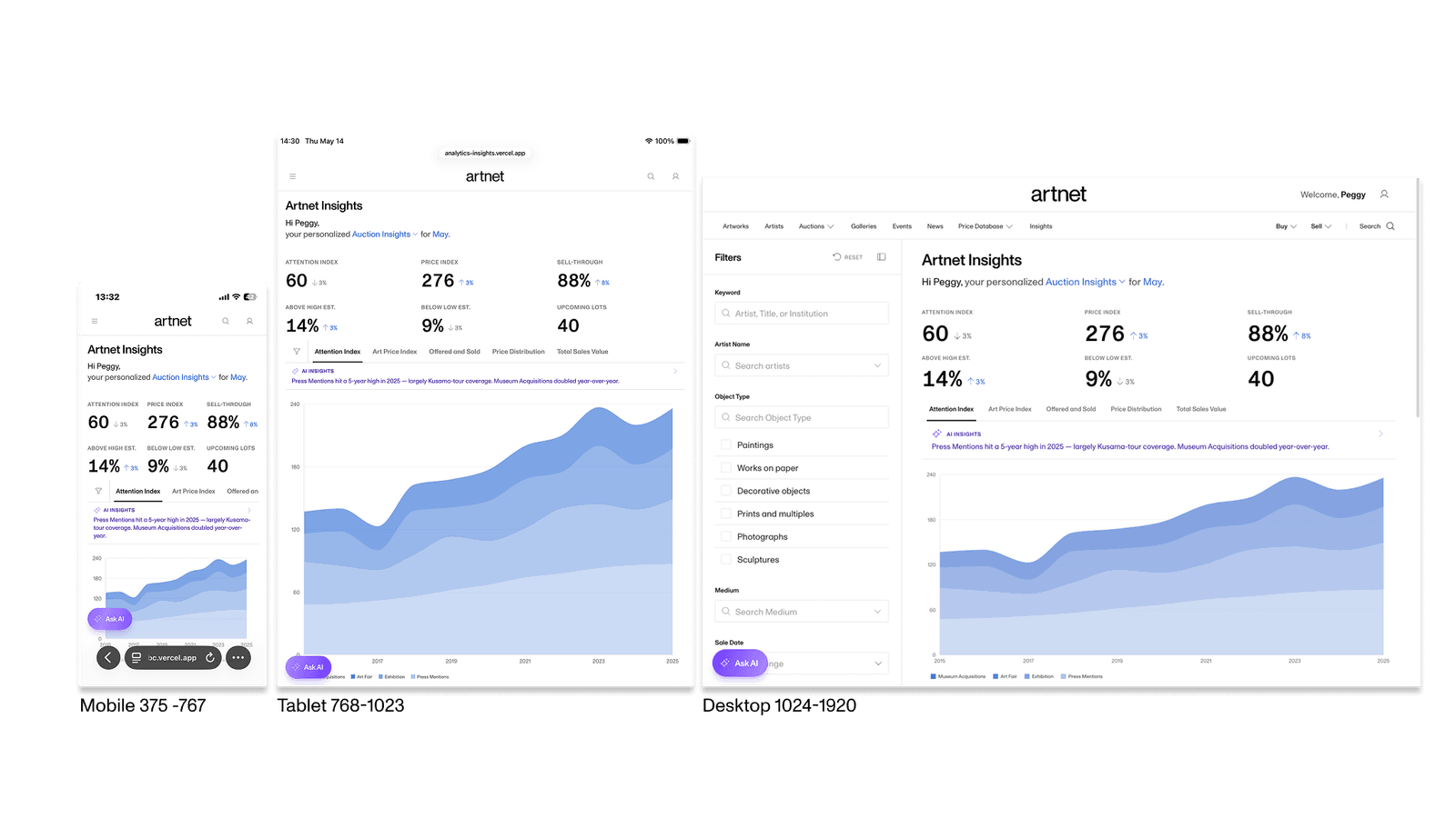
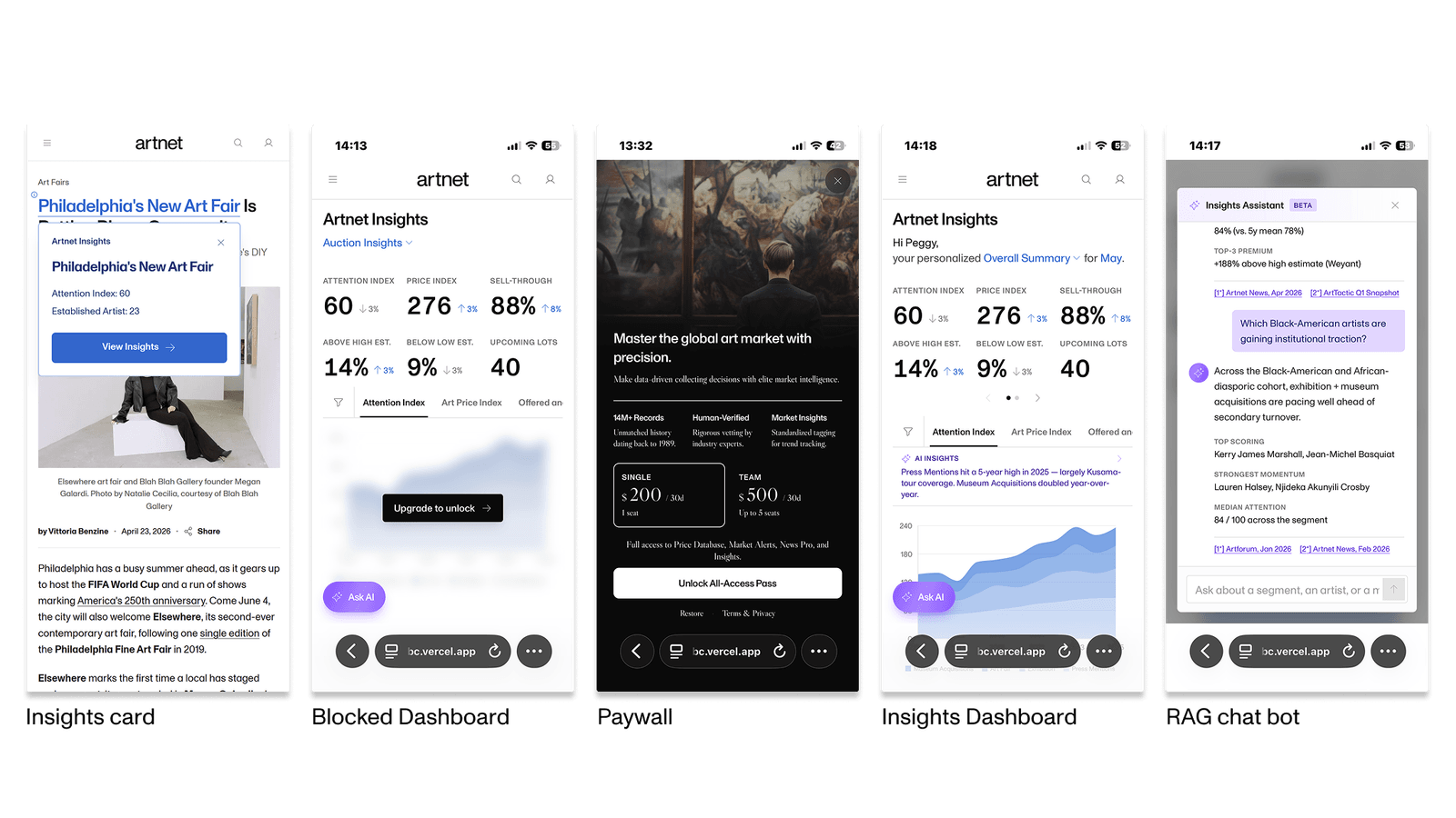
The final output is a fully operable, high-fidelity interactive prototype, covering the Insights Card, the subscription-upgrade flow, the analytics dashboard, and the AI research interface, and it supports desktop, tablet, and mobile. The prototype mainly validates whether, once the existing content is reorganized, it lowers the barrier to research and creates a new way of using the data.

View the live prototype
The Insights dashboard rendered responsively on mobile, tablet, and desktop.
One layout system, flexibly adapting across desktop, tablet, and mobile.
Five high-fidelity mobile screens in sequence: the Insights card, a blocked dashboard, the paywall, the unlocked Insights dashboard, and the RAG chat bot.
The end-to-end mobile journey: from tapping an Insights Card, through the access lock and paywall, to unlocking the dashboard and using the AI RAG retrieval feature.

Future metrics to watch and validate

Since this is still a proof-of-concept stage, if it moved into productization, these directions could be watched first:

Freemium conversion rate

Whether the free basic analysis content effectively lifts subscription conversion.

Research-feature stickiness

Whether users start reading market signals beyond price.

Long-term retention and return rate

Whether the product gradually becomes part of the daily research workflow.

REFLECTION

Data is never scarce; the challenge is building interpretive context

This project made me rethink the value a data product really provides. A lot of the time, the problem is that users lack a way to build understanding quickly. AI's value is in helping organize, search, and connect information, while the final judgment and decision still come from human experience and expertise.

Questions worth exploring next

How soft information affects decisions

Do exhibition history, cultural influence, and provenance really change market judgment?

AI's role in professional research workflows

Should AI be an analysis tool, a research assistant, or a new research entry point?

These are also directions worth continuing to validate.