Culture Hop Taiwan: Building Cultural Soft Infrastructure
- Dec 27, 2025
- 4 min read
Updated: Mar 29
How I turned fragmented government data into a bilingual, map-first event discovery platform, and what I learned designing for language barriers, messy APIs, and mobile performance.

TL;DR
Problem: Taiwan's cultural events are fragmented across 20+ platforms, creating a language barrier that locks out non-native explorers
Research: Situational User Matrix mapped 4 user contexts across language proficiency × planning style
Insight: 3 core Jobs-to-be-Done emerged — consolidated access, linguistic inclusion, and spatial clarity
Solution: AI local pipeline (Ollama + Gemma 3) that detoxes government data into a bilingual, map-first experience
Outcome: A self-sustaining platform serving both spontaneous travelers and strategic locals
Live: culturehoptaiwan.com/en
A discovery problem hiding in plain sight
Taiwan has a thriving cultural scene, indie markets, gallery openings, live performances, but finding them as a non-native speaker is frustrating.
The Ministry of Culture publishes event data through an open API, but it's Chinese-only, formatted like an administrative spreadsheet, and requires technical knowledge to access. Ticketing platforms like OPENTIX cover major venues but exclude grassroots activities. Airbnb Experiences is inactive in Taiwan.
The result: a city full of culture that's effectively invisible to international visitors and even some locals.
I saw an opportunity to build a curatorial layer — a "soft bridge" that transforms raw government data into an intuitive, bilingual, map-based experience. That became Culture Hop Taiwan.

Who I was designing for
Rather than defining abstract personas, I mapped users by two real behavioral axes: language proficiency and planning style. This produced four situational contexts that shaped every design decision.
The Situational Contexts
These quadrants represent the various circumstances a user might find themselves in:

Each quadrant revealed a distinct friction point. Non-native, spontaneous explorers had no reliable discovery tool beyond hotel tips and Instagram. Planned travelers found English content nearly non-existent. Fluent locals dealt with calendar fragmentation across 20+ platforms. This framing directly informed the three Jobs-to-be-Done the platform had to fulfill.
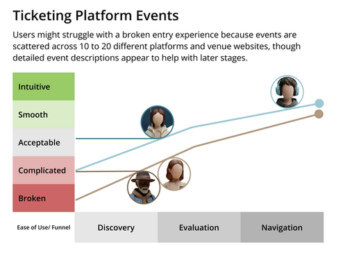
The User Journey: Mapping the Friction
To validate these situational contexts, I mapped the current user journey across two primary cultural streams: Professional Ticketing Platforms and Grassroots Activities.
This visualization highlights where the "Soft Bridge" is currently broken.


Defining the Challenge: The Jobs-to-be-Done
Based on the journey mapping of fragmented platforms and rigid data, I identified three core "Jobs" that this platform must fulfill to bridge the cultural gap:
Consolidated Access: "When I am looking for something to do, I want a single, reliable entry point for all events—from major venues to grassroots pop-ups—so I don't have to struggle with 20 different websites."
Linguistic & Contextual Inclusion: "When planning as a non-native, I want to understand the vibe and details of a performance in my language, so I can evaluate events as easily as a local would."
Spatial Clarity: "When overwhelmed by fragmented updates, I want to see everything in a unified spatial context so I can plan my route without the exhaustion of switching apps.".
How I built the pipeline
With the three jobs defined, I designed each layer of the system to directly resolve a specific gap.

1. Consolidated Access
The Problem: 20+ scattered platforms and broken entry points.
The Solution: The Factory (Ollama + Python) crawls and pulls data from disparate sources into a Single Warehouse (Supabase).
Value: Users no longer need to hunt through dozens of websites; everything is in one place.
2. Linguistic & Contextual Inclusion
The Problem: Rigid, Chinese-only administrative data that excludes non-locals.
The Solution: An AI-driven pipeline translates and rewrites raw text into engaging, bilingual descriptions.
Value: Transforms a "digital archive" into a living gateway that everyone can understand and evaluate.
3. Spatial Clarity
The Problem: Overwhelming updates with no geographical context.
The Solution: The Storefront (Next.js + Supercluster) anchors all cleaned data to a high-performance Map View.
Value: Enables intuitive, mobile-first navigation—letting users see what's happening "right here, right now."
The system runs as a continuous loop across four layers, each feeding the next, with the Monitor closing the cycle back to the Factory.

To see what this means for an actual user trying to find something to do on a Saturday afternoon, here's the journey side by side.

The shift isn't just about trying to solve language barrier. It's about collapsing a multi-app, multi-tab, multi-language process into a single coherent flow, from discovery to decision, in one screen. Building that flow cleanly meant confronting several real engineering and design challenges.
Key challenges
Mobile performance.
Loading 3,000+ events on a mobile map produced a Lighthouse score of 27/100 at launch. I implemented a prioritized loading strategy — the server immediately renders Featured events while the full map index loads silently in the background — alongside aggressive lazy loading, skeleton screens, and ISR caching with a one-hour revalidation window. The score reached 65/100: not perfect, but fluid enough for real use.
Dirty data.
Government records are inconsistent. Many events had no GPS coordinates, requiring AI-inferred locations based on venue names. Address formats varied wildly across submissions. I built a canonical venue mapping system to resolve this programmatically.
Bilingual search.
Search had to query simultaneously across English titles, Chinese summaries, and AI-generated tags. State synchronization between the map view, list view, and category counters (during live panning) required custom logic to avoid race conditions and stale UI.
What's next
The architecture is intentionally lightweight, local AI processing keeps operational costs minimal, making the platform viable without requiring high traffic to sustain. I'm monitoring two possible evolution paths: formalization as official cultural infrastructure, or a pivot toward an editorial, discovery-driven publication if meaningful traffic emerges.
The Monitor will guide that decision, not a roadmap written in advance.


